Recruitment-Tracker: The ATS That Thinks Like a Dashboard
A small SQL and Power BI project that turns recruitment into a measurable pipeline, with requirements, submissions, and recruiter activity all tied together in one lean data model.
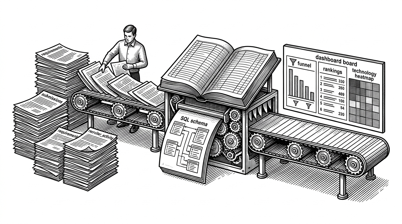
- Recruitment-Tracker is not trying to be a full ATS, because it is built to explain hiring through data instead of workflow UI.
- Its schema separates demand, candidate supply, and recruiter effort, which makes pipeline analysis sharper than simple recordkeeping.
- The `recruiter_activity` table is the quiet trick, because it measures work independently from outcomes.
- Power BI is the last mile here, not the core product, so the repo reads like a compact BI system with recruiting as its subject.
A tracker that skips the app layer
Most ATS tools start with screens: candidate profiles, interview stages, calendars, permissions, alerts. Recruitment-Tracker starts somewhere else. It treats hiring as a reporting problem, then builds the minimum machinery needed to make the numbers legible.
That choice changes the whole project. Instead of optimizing for user workflows, the repo optimizes for a clean data path: CSVs in, SQL in the middle, Power BI out. For a small recruiting team, a solo analyst, or a portfolio project, that is often the more honest architecture.
The README and SQL make the intent clear: this is a bridge between operational data and executive reporting, not a general-purpose hiring platform.
The model behind the funnel
The schema is small, but it is doing real conceptual work. The database centers on three tables: `requirements`, `submissions`, and `recruiter_activity`. Each one maps to a distinct layer of the hiring process.
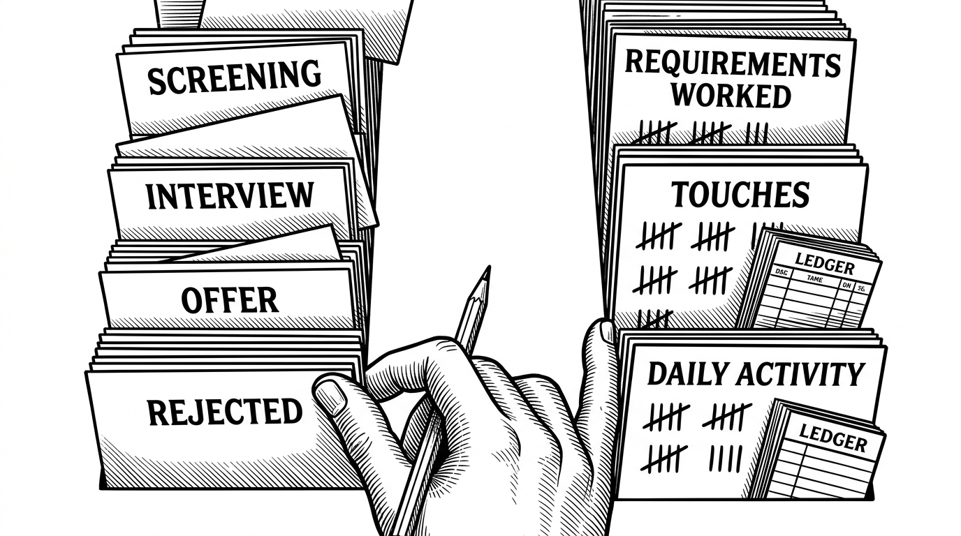
`requirements` holds demand. It describes what needs to be filled, including client context, role details, and the technology stack. `submissions` holds supply. It ties candidates to a requirement through `req_id`, and its `status` column drives the funnel. `recruiter_activity` holds performance, not outcomes, which is where the project gets interesting.
CREATE TABLE submissions (
  submission_id INT AUTO_INCREMENT PRIMARY KEY,
  req_id INT,
  candidate_name VARCHAR(100),
  recruiter_name VARCHAR(100),
  status VARCHAR(50),
  FOREIGN KEY (req_id) REFERENCES requirements(req_id)
);

CREATE TABLE recruiter_activity (
  activity_id INT AUTO_INCREMENT PRIMARY KEY,
  recruiter_name VARCHAR(100),
  requirements_worked INT,
  activity_date DATE
);
That foreign key matters. It prevents ghost submissions that do not belong to a real requirement. More importantly, it says the project cares about integrity at the point where reporting starts to become trustworthy.
Why recruiter activity is the smartest table
The project’s best idea is also its least flashy one: recruiter work is logged separately from candidate movement. That means the dashboard can ask a more useful question than, “How many candidates got through?” It can ask, “How much recruiter effort produced that result?”
That distinction turns the repo from recordkeeping into analysis. A recruiter can touch many requirements and still produce few offers. Another can generate stronger conversion with less activity. The model lets you compare those cases without inventing extra logic later.
The analytical payoff is visible in the SQL. The repo pre-bakes simple pipeline queries, so the reporting layer does not need to rediscover the same metrics every time.
SELECT status, COUNT(*)
FROM submissions
GROUP BY status;

SELECT *
FROM submissions
WHERE status IN ('Interview', 'Offer');
Those queries are basic on purpose. They reveal the project’s priority: make funnel health readable fast. The insight is not fancy machine learning or workflow automation. It is visibility.
What Power BI is really doing here
The `.pbix` file is the presentation layer, not the product. It consumes the structured data and turns it into views a manager can use: recruiter comparisons, funnel summaries, and technology heatmaps. That is the last mile, not the core system.
This is where the project feels different from a standard app build. In a typical ATS, the interface is the main event. Here, the dashboard is the main event. The database exists to make reporting trustworthy and repeatable.
| Approach | Data entry | Schema complexity | Reporting strength | Setup cost | Best fit |
|---|---|---|---|---|---|
| Recruitment-Tracker | CSV import plus SQL tables | Low to moderate | Strong, because metrics are modeled directly | Low | Small teams, analysts, portfolio demos |
| Traditional full-stack ATS | Dedicated app UI and workflows | High | Strong, but often buried inside the product | High | Organizations needing end-to-end operations |
| Spreadsheet tracking | Manual entry in sheets | Very low | Weak to moderate, depending on discipline | Very low | Tiny teams and temporary use cases |
The comparison is blunt for a reason. This repo is not trying to compete with Greenhouse or Lever on feature breadth. It is trying to win on simplicity, transparency, and reporting speed.
What this repo teaches better than a full ATS
For analysts and builders, the real lesson is structural. Start with raw records. Shape them into a schema that reflects the business process. Put analysis on top. Then let a visualization layer do the storytelling.
That sequence is useful outside recruiting too. Any domain with demand, output, and effort can benefit from the same pattern. The reason this repo works as an editorial example is that it shows the chain clearly, without the noise of a larger application.
The result is a compact data product. It is narrower than a commercial ATS, but clearer in what it measures. That clarity is the point.