vendor-performance-analysis-sql-python-powerbi-test: Vendor Performance Analysis: The Retail Dashboard That Puts SQL Before the Chart
A clean SQLite and Python pipeline turns messy retail exports into vendor-level profit, turnover, and statistical evidence. The interesting part is not the dashboard. It is how the repo proves the dashboard is telling the truth.
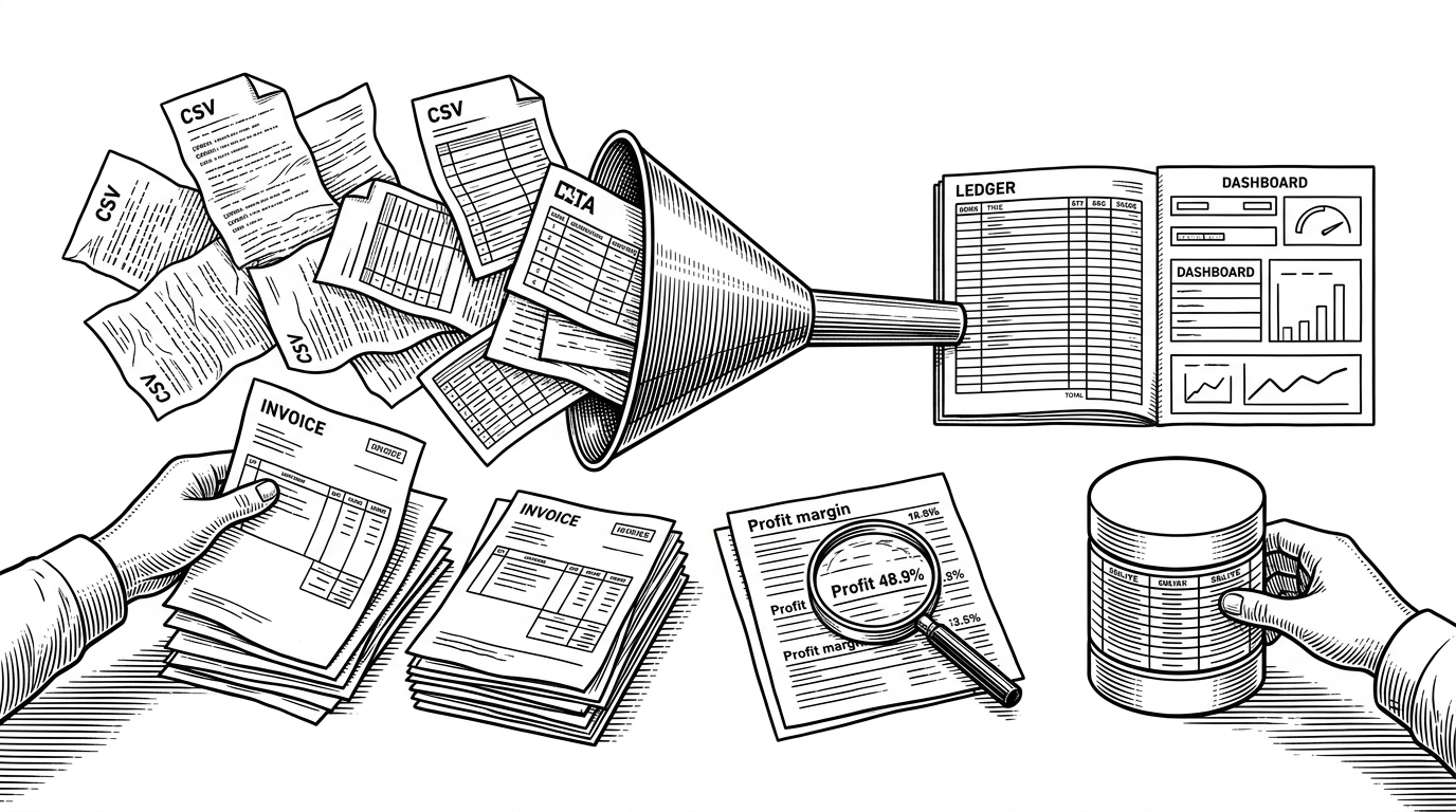
- This repo treats vendor performance as an evidence pipeline, not a dashboard exercise.
- SQLite, SQL CTEs, Pandas cleanup, and a t-test work together to turn raw retail exports into claims the analysis can defend.
- The strongest insight is business-facing, with bulk purchasing, vendor concentration, and margin differences all tied back to source data.
- The project reads like a blueprint for local analytics work because it separates ingestion, validation, and presentation into distinct layers.
Most vendor dashboards are easy to admire and easy to distrust. This one is more interesting because it behaves like a small analytics system: ingest raw CSVs, consolidate them in SQLite, do the heavy joins in SQL, clean the output in Pandas, and then test whether the story holds up statistically. The dashboard is the surface. The method is the product.
That matters because vendor analysis can become decorative fast. A pretty chart can tell you who sold the most. It cannot, by itself, prove that bulk purchasing created real savings or that one vendor group materially outperformed another. This repo tries to cross that line.
From CSV pile to SQLite backbone
The architecture is simple in the best way. Raw files land in a local `data/` folder, a Python ingestion script walks the directory, and each CSV becomes a table in SQLite with `to_sql(..., if_exists='replace')`. That means the repo favors a full-reload snapshot model, which is a good fit for periodic retail exports.
That choice is more disciplined than it sounds. SQLite gives the project a local warehouse without cloud overhead, and the reload strategy keeps the logic transparent. If the source files change, the database reflects the new snapshot instead of pretending to support a streaming workload it does not need.
The real brain is the vendor summary query
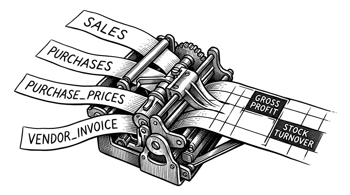
The repo’s center of gravity is the SQL CTE in `get_vendor_summary.py`. It joins purchases, purchase prices, sales, and vendor invoices into a single vendor-brand grain where profit, margin, and turnover can be computed together. That is the move that turns scattered operational tables into a decision-ready model.
This is also where the project earns its credibility. The analysis is not built on one tidy spreadsheet. It is assembled from multiple source tables that each tell part of the story. The query does the work of reconciliation, and the result is a summary that can support actual vendor comparisons instead of loose impressions.
Why the project goes beyond descriptive analytics
The notebook does something many dashboard projects never attempt. It uses a t-test to compare profit margins between vendor groups, which shifts the question from “what happened?” to “is the difference likely real?” That is a different level of argument.
Descriptive analytics can show that one group appears better. Inferential analytics asks whether that gap survives noise. In a vendor context, that distinction matters because procurement decisions are expensive, and the difference between a pattern and a coincidence can change how a team negotiates or consolidates suppliers.
Cleaning is the product, not a footnote
The cleanup logic is what makes the analysis feel real. The repo strips whitespace from fields like vendor names and descriptions, removes rows with zero sales, and filters out negative-profit outliers. Those are not cosmetic steps. They are the difference between a query that runs and a query that can be trusted.
Retail ERP exports are messy in predictable ways. Names drift because of trailing spaces. Dead rows hang around. Outliers from freight, returns, or bad postings can distort the picture. The project handles those issues explicitly, which is a sign it was built by someone who expects the data to fight back.
The sharpest business insight is bulk purchase leverage
The most memorable finding is the bulk-purchase result. The analysis says large orders produced 72% cost savings per unit, which is the kind of number a procurement lead can act on immediately. It also points to vendor concentration, which turns the same pipeline into a supply-risk discussion rather than just a margin story.
That combination is the real payoff. The repo is not just saying one vendor sold more than another. It is showing how purchase volume, price, and downstream profit interact. That is much closer to how a real buying team thinks.
| Approach | What it answers | Where it breaks |
|---|---|---|
| Dashboard-only analytics | Shows who sold the most and where margins appear strong | It can hide weak data quality and cannot defend causality or significance |
| This repo | Reconciles source tables, cleans the data, and tests vendor differences | It stays local and manual, so it is built for analysis, not automation at scale |
| Enterprise SCM or ERP suites | Delivers broad procurement and supplier management at scale | It is heavier, slower to inspect, and harder to adapt for a focused question |
Why this looks like a blueprint, not a library
The repository has the right maturity signals. Scripts are separated from notebooks. Logging is present. The database is treated as a reproducible local artifact. Presentation lives in Power BI, while the data logic stays in Python and SQL. That separation is exactly what you want when a project is meant to explain an answer instead of merely display one.
There is also a practical honesty to the repo. Saved notebook errors are not hidden behind polish, which is normal in a project that depends on a local database and raw data files. The structure still reads cleanly. It looks like someone designed for inspection first and packaging second.
How it stacks up
Compared with dashboard-only BI work, this repo is more defensible because the analysis chain is visible. Compared with enterprise SCM tools, it is lighter, cheaper, and easier to audit locally. Compared with a cloud-heavy analytics stack, it is simpler to run and easier to understand, though less automated and less elastic.
That makes it a good pattern for analysts who need to prove a point before they scale the stack. It is not trying to replace the warehouse, the ERP, or the BI platform. It is showing how to build a small, inspectable system that can survive scrutiny.
| Option | Strength | Trade-off |
|---|---|---|
| Dashboard-only BI | Fast to present, easy for stakeholders to consume | Weak on provenance and statistical credibility |
| Enterprise SCM or ERP | Built for breadth and governance | Heavy, expensive, and harder to customize |
| SQLite plus Python plus BI | Lean, local, and transparent | Manual by design, so it suits analysis more than production ops |