TalentScope: The Interview Platform Built from Three Backends
Clerk handles identity, Convex keeps the room in sync, and Stream carries the call. The interesting part is how cleanly the handoffs work.
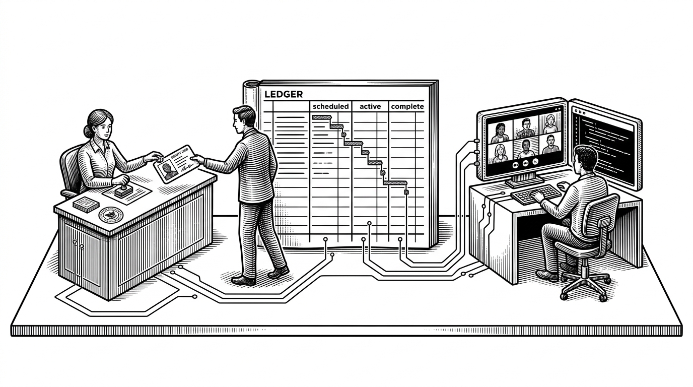
- TalentScope is really a choreography layer, not a video app, because Clerk, Convex, and Stream each own a narrow slice of the experience.
- The Clerk webhook sync is the key architectural move, since it turns authentication events into durable app data without duplicating identity logic.
- The interview room feels coherent because setup, call state, and the Monaco editor all sit inside one controlled React flow.
- The dashboard is compelling because Convex turns interview updates into a live control surface instead of a page that needs manual refreshes.
The app's real trick: it never asks one system to do everything
TalentScope is easiest to understand as a choreography layer. Clerk handles who you are, Convex remembers what the product knows, and Stream moves the live call. That separation is the point. The app feels unified because each boundary is narrow and explicit.
Clerk signs the user in. Convex remembers who they are.
This is the cleanest technical pattern in the repo. Clerk owns authentication, but the app does not let identity live only inside the auth layer. A webhook hands the user event to Convex, where it becomes a real record with role, email, and other app-specific fields.
// convex/http.ts
export const http = httpRouter();
http.route({
path: "/clerk-webhook",
method: "POST",
handler: httpAction(async (ctx, req) => {
const event = await verifyClerkWebhook(req);
if (event.type === "user.created" || event.type === "user.updated") {
await ctx.runMutation(api.users.syncUser, {
clerkId: event.data.id,
email: event.data.email_addresses[0]?.email_address,
name: event.data.first_name,
});
}
return new Response("ok");
}),
});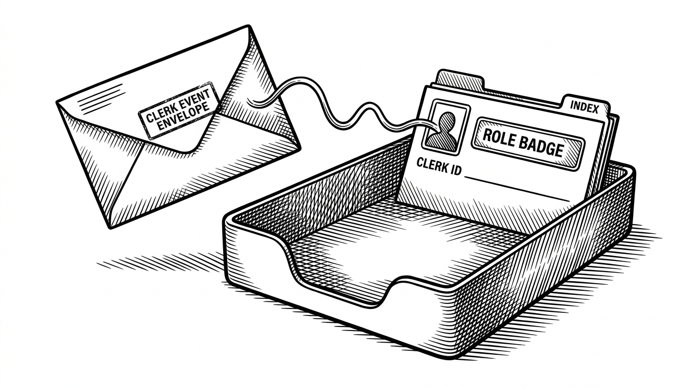 the webhook sync pattern solves the two-sources-of-truth problem by turning auth events into app data." data-prompt="Create an editorial illustration rendered entirely in black ink on a pure white background.
The image depicts a stamped Clerk event envelope landing in a Convex inbox tray. Inside the tray, a user record card emerges with a role badge, a clerk id line, and a small index tab, while a thin line connects the envelope to the record like a data conduit. The artist uses tightly packed crosshatching lines layered at different angles to build up shadow and form, with clean open areas of white for highlights. The line work has the quality of a classic metal engraving, precise and deliberate, with varied line weights where bold contour lines define shapes and finer interior lines create tonal depth. The overall style evokes vintage newspaper editorial illustrations from The Economist or Wall Street Journal. No color, no gradients, no grey fills. Only black lines on white. The background MUST be pure white #FFFFFF. No paper texture, no cream, no off-white, no noise, no grain. Perfectly clean flat white background." loading="lazy">
the webhook sync pattern solves the two-sources-of-truth problem by turning auth events into app data." data-prompt="Create an editorial illustration rendered entirely in black ink on a pure white background.
The image depicts a stamped Clerk event envelope landing in a Convex inbox tray. Inside the tray, a user record card emerges with a role badge, a clerk id line, and a small index tab, while a thin line connects the envelope to the record like a data conduit. The artist uses tightly packed crosshatching lines layered at different angles to build up shadow and form, with clean open areas of white for highlights. The line work has the quality of a classic metal engraving, precise and deliberate, with varied line weights where bold contour lines define shapes and finer interior lines create tonal depth. The overall style evokes vintage newspaper editorial illustrations from The Economist or Wall Street Journal. No color, no gradients, no grey fills. Only black lines on white. The background MUST be pure white #FFFFFF. No paper texture, no cream, no off-white, no noise, no grain. Perfectly clean flat white background." loading="lazy">
That choice does more than keep the database tidy. It means roles, scheduling, and interview history can all hang off the same durable record. You are not translating between an auth provider and an app database every time the UI needs a decision.
Inside the interview room
The candidate flow is built to feel calm. `MeetingSetup.tsx` handles camera and microphone checks, then the view switches into `MeetingRoom.tsx` inside a `StreamCall` provider. That wrapper matters because the call context, the live controls, and the editor all need the same session state before the interview starts.
<StreamCall call={call}>
  {joined ? (
    <MeetingRoom interviewId={id} />
  ) : (
    <MeetingSetup onJoin={() => setJoined(true)} />
  )}
</StreamCall>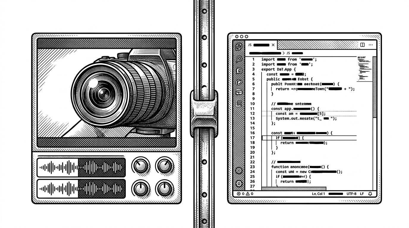
The clever part is that the room does not try to be a full collaboration suite. It is opinionated. The editor is there to support the interview, not to become the product itself.
Why the dashboard feels instant
The interviewer experience becomes compelling only when the backend loop closes. Convex queries keep the dashboard live, so a status change or a new comment appears without a refresh. Pass, fail, and notes all ride the same data path, which makes the whole control surface feel immediate.
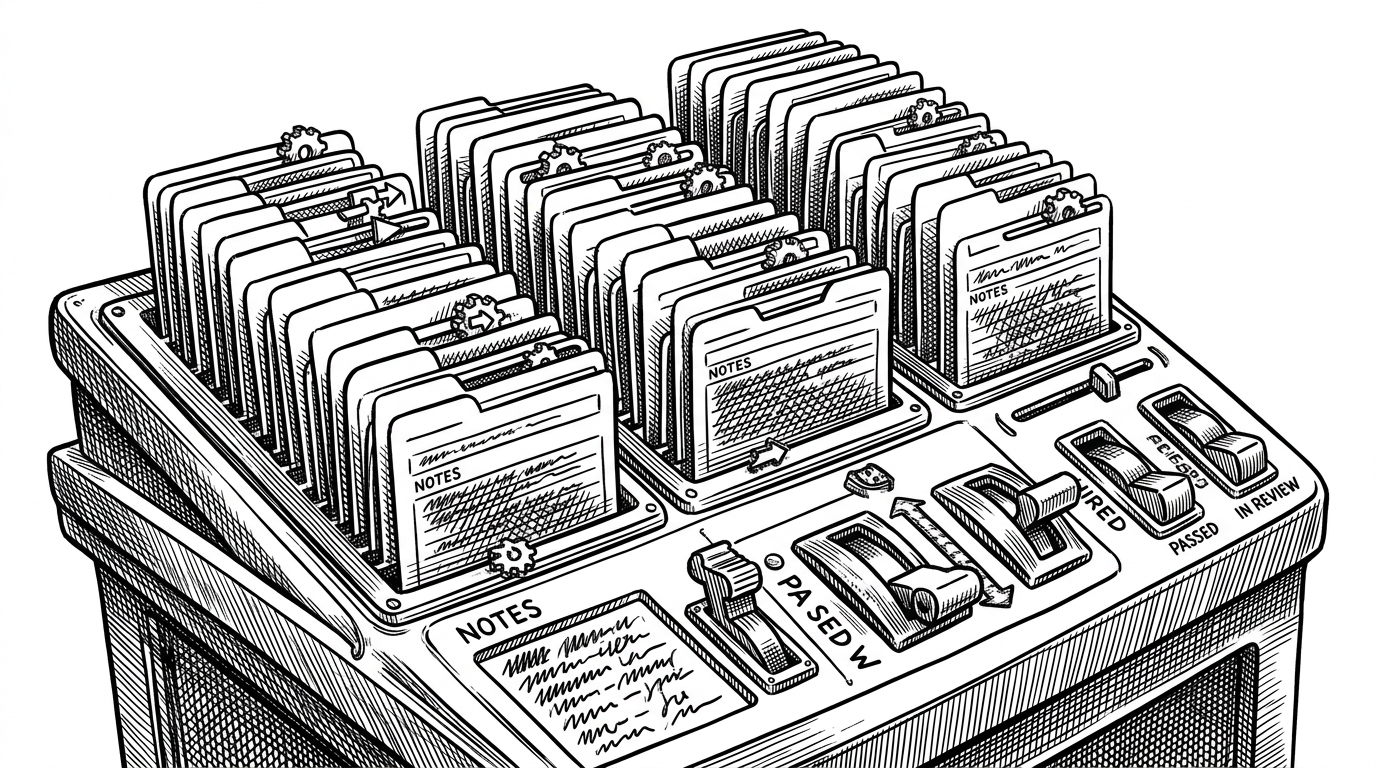
That is what makes the product feel alive. The interviewer is not managing a pile of disconnected tools. They are working inside one feedback loop where outcome, comment, and record update each other.
What this replaces, and what it does not
| Approach | What you assemble | What it buys you |
|---|---|---|
| Generic meeting stack | Video call, shared doc, separate notes, manual follow-up | Flexibility, but lots of context switching and weak state cohesion |
| Custom build | WebRTC, auth, token generation, realtime storage, role logic | Maximum control, but you own the plumbing and the edge cases |
| TalentScope | Clerk, Convex, Stream, Monaco, and a workflow on top | Opinionated interview flow with far less integration overhead |
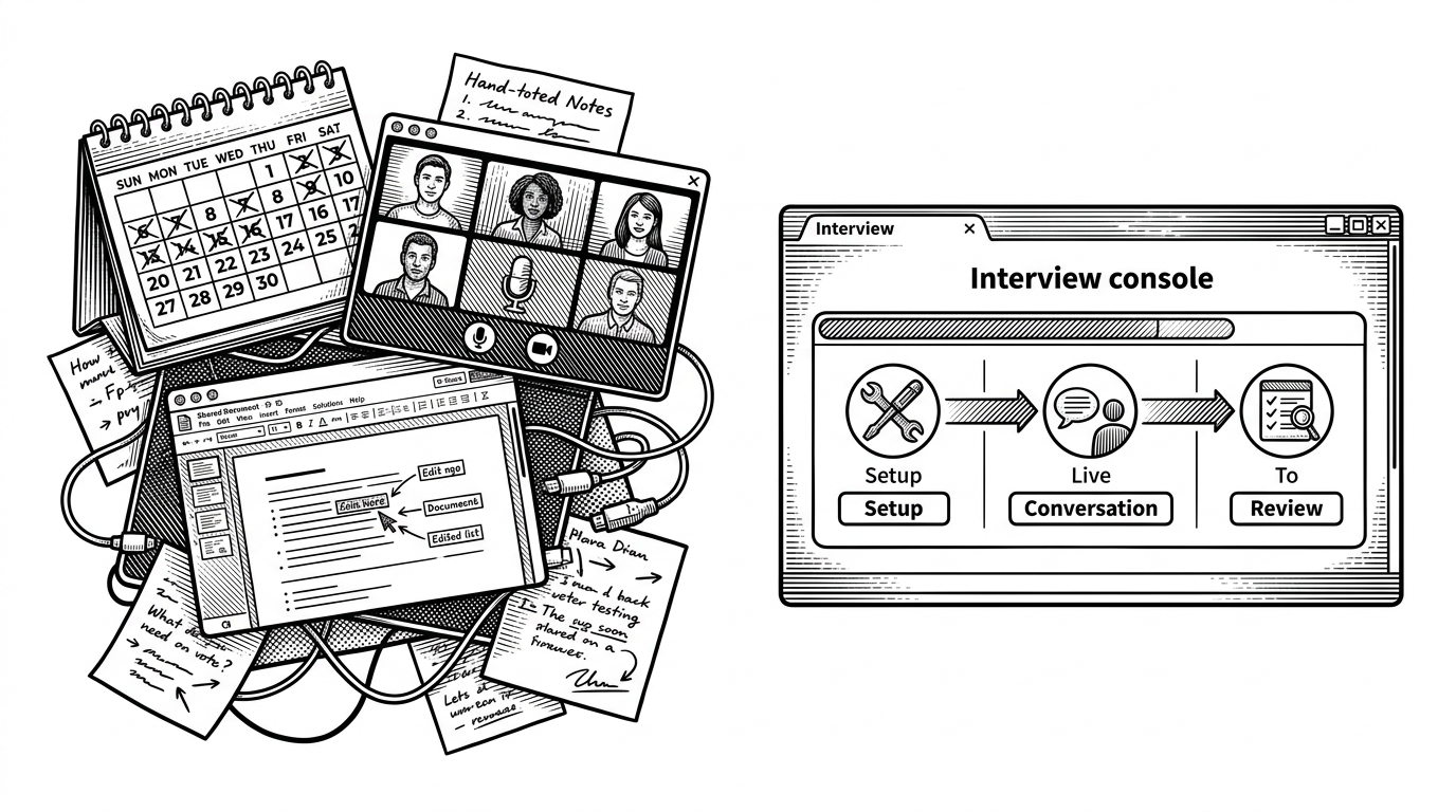
That comparison is the real verdict. TalentScope is not trying to be Zoom, and it is not trying to be a general collaboration platform. It is an opinionated interview system, and that is why the architecture stays so legible.
The tradeoffs hidden behind the elegance
The codebase is clean, but it is still young. The strongest pattern here is the separation of identity, state, and media, yet that same discipline exposes a limitation: the editor looks more local-first than truly collaborative. For a live coding interview, that is acceptable. For pair programming at scale, it would need a shared-state layer.
There is also a broader tradeoff in the stack itself. By leaning on managed services, the project avoids a custom server and a lot of operational complexity, but it also depends on vendor boundaries staying stable. That is a smart bet for an interview product, not a universal one.