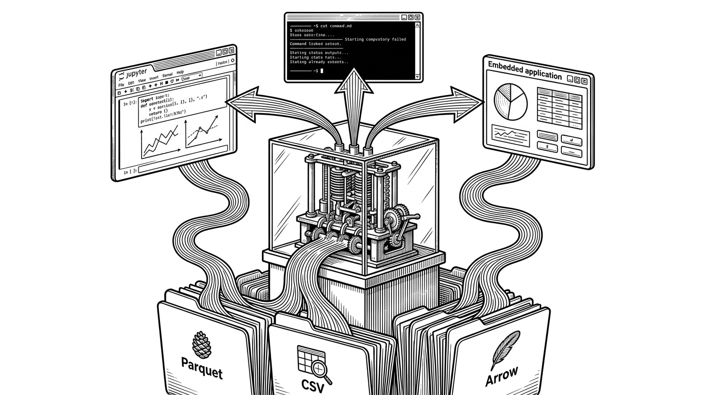
ComfyUI-MemoryVisualization: Turning VRAM Into a Live Map of Model Residency
A real-time ComfyUI diagnostic tool that shows not just how much memory is used, but which model pages are actually sitting in GPU memory, how they move, and why OOM bugs become visible.


Reduce tiled decode peak memory
- ComfyUI-MemoryVisualization turns memory into a residency map, which is more useful for debugging than a single VRAM total.
- Its main value is not broader observability, but page-level visibility inside the workflow where model loading and unloading actually happen.
- The frontend preserves fleeting memory events with a fade system, so short-lived churn stays readable instead of disappearing between samples.
- The tool is powerful because it sits close to ComfyUI internals, and fragile for the same reason.
The part nobody else shows: which pages are actually in VRAM
Most memory tools answer one question: how full is the GPU? This repo asks a better one: which pages of the model are resident right now, and which ones are already fading out of view. That shift matters because ComfyUI users do not debug with a single workload and a single model. They juggle load order, system RAM pressure, VRAM ceilings, and model swaps inside the same workflow.
That is why the visual metaphor lands. Instead of a meter, you get a terrain. Instead of a static total, you get a moving record of residency, churn, and decay.
Dynamic VRAM fundamentally changes how ComfyUI handles model weights, making the experience much smoother for users on memory-constrained hardware.
Why ComfyUI needs this kind of visibility
ComfyUI is unusual because the UI and the memory problem live in the same place. A workflow can pull in large checkpoints, swap components, and create transient peaks that never show up in a casual dashboard. When something fails, the failure is often not "out of memory" in the abstract. It is fragmentation, a slow leak, or a model that stayed resident longer than you expected.
| Visibility level | What you see | What you miss | Best use |
|---|---|---|---|
| Generic VRAM bar | One aggregate usage number | Which pages are hot, changing, or pinned | Quick status checks |
| PyTorch profiler | Trace events and allocations | Workflow context and live model residency | Low-level profiling sessions |
| Native ComfyUI memory handling | Automatic loading behavior | Why a specific node caused a spike | Day-to-day use |
| ComfyUI-MemoryVisualization | Page-level residency plus history | Broader system observability outside ComfyUI | Interactive debugging inside the workflow |
That comparison is the point. This repo does not try to beat a profiler at profiling. It tries to make the exact failure mode visible to the person who is already inside ComfyUI when the problem happens.
How the data gets pulled out of the system
On the backend, `__init__.py` acts as a bridge between ComfyUI internals and the browser. It pulls CUDA statistics from Torch, system RAM data from `psutil`, and loaded-model metadata from `comfy.model_management.current_loaded_models`. If Aimdo residency data is available, the node can also expose page-level heatmaps that show which parts of a model are actually seated in VRAM.
That is important because the repo is not synthesizing a guess. It is surfacing state that already exists inside the runtime, then packaging it for visualization and control.
The frontend is the real performance trick
The real craft is in `web/aimdo_viz.js`. The tool uses a ring buffer instead of shifting arrays, which keeps historical samples cheap to store. It renders with Canvas rather than DOM nodes, which matters once the page count gets large enough that naive UI updates would stutter.
// Conceptual shape of the render path
const history = {
  values: new Float64Array(MAX_SAMPLES),
  head: 0,
  len: 0,
};

function pushSample(v) {
  history.values[history.head] = v;
  history.head = (history.head + 1) % history.values.length;
  history.len = Math.min(history.len + 1, history.values.length);
}

function drawFrame(ctx) {
  drawGraph(ctx);
  drawPageGrid(ctx);
  requestAnimationFrame(drawFrame);
}
The fade behavior matters more than it sounds. Memory events can be faster than perception, so the UI extends their visibility without pretending to be more precise than the underlying samples. That is a good diagnostic trade-off: preserve evidence, do not overstate certainty.
What this tool replaces, and what it does not
This repo sits in a narrow but valuable lane. It replaces guesswork when a generic graph is too coarse and a full profiler is too far away from the workflow. It does not replace broad observability, benchmark suites, or proper memory analysis outside ComfyUI.
| Tool | Strength | Weakness | Why it loses here |
|---|---|---|---|
| Generic dashboard | Easy totals and trends | No page-level context | Too blunt for workflow debugging |
| PyTorch profiler | Detailed allocation traces | Manual setup, separate workflow | Not embedded where the issue appears |
| Native ComfyUI handling | Automated and convenient | Hides the underlying residency story | Optimizes use, not explanation |
| ComfyUI-MemoryVisualization | Residency map inside the app | Specialized and tightly coupled | Best when you need to see churn, not just capacity |
That specialization is the trade-off. Tight integration buys clarity, but it also makes the tool depend on upstream ComfyUI behavior and internal memory APIs. For power users, that is acceptable. For everyone else, it is probably more detail than they want.