ticket-booking-frontend: QuickShow: The Movie Booking Frontend That Bets on LocalStorage, Stripe, and a Very Short Return Trip
A clean React app that turns seat selection into a lightweight payment reconciliation flow, then wraps it in a cinematic UI that feels bigger than the codebase behind it.
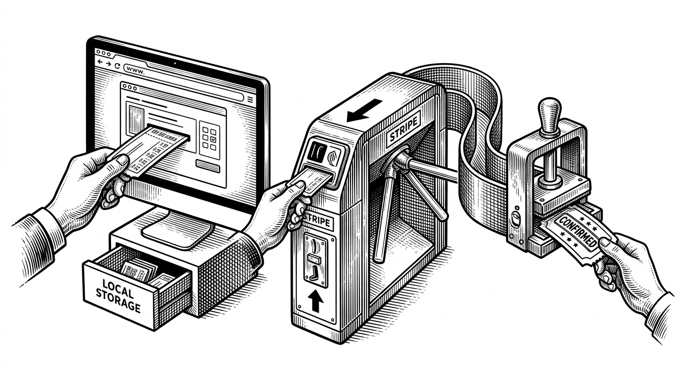
- QuickShow’s real product insight is that booking intent can live in the browser until Stripe proves the user actually paid.
- The app keeps the backend lean by avoiding a database full of abandoned pending bookings.
- Its strongest technical choice is the handoff across redirect state, not the movie discovery UI on top of it.
- The trade-off is clear: the flow is elegant on one device and one browser, but fragile if that local state disappears.
The clever part is what happens after Stripe
Most booking apps create a pending record first, then try to collect payment, then reconcile the result. QuickShow flips that order. It stores the booking intent in localStorage, sends the user through Stripe, and only writes the booking when the app sees paid=true on the return trip.
That is the thesis of the repo. It keeps the backend free of abandoned bookings, avoids a half-finished database trail, and turns checkout into a clean confirmation handshake. The cost is durability: if the tab closes, the browser clears, or the user returns somewhere else, the intent can vanish with it.
| Traditional booking flow | QuickShow flow | Trade-off |
|---|---|---|
| Create a pending booking in the database first, then pay, then confirm. | Save intent locally, pay first, then reconcile on return. | Traditional flow is durable, but it fills the backend with abandoned records. |
| The backend owns the in-flight state. | The browser owns the in-flight state. | QuickShow is lighter, but it depends on one device and one browser session. |
| Failures usually leave a trace in the database. | Failures can disappear with the tab. | QuickShow is simpler to operate, but weaker as a recovery system. |
QuickShow is really two apps in one: browsing and commitment
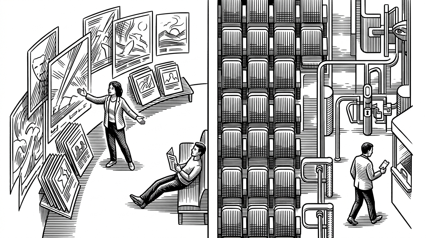
The app keeps discovery and checkout separate. You browse films, open a details view, choose seats, then commit. That split matters because it avoids cramming search, selection, payment, and confirmation into one overloaded screen.
The seat map is the product’s hardest logic
Seats.jsx is where UX and correctness collide. The grid runs from rows A to F, occupied seats are blocked, and a showtime must be set before selection is allowed. The code has to feel simple to the user while enforcing rules the user never wants to think about.
if (!time) {
  toast.error('Please select a showtime first');
  return;
}

const isOccupied = occupiedSeats.includes(seatId);
if (isOccupied) return;

setSelectedSeats(prev =>
  prev.includes(seatId)
    ? prev.filter(seat => seat !== seatId)
    : [...prev, seatId]
);
That little guardrail does a lot of work. It prevents invalid state, keeps occupied seats inert, and makes seat choice feel deterministic instead of hopeful.
| Naive seat picker | QuickShow seat picker | Why it matters |
|---|---|---|
| Any seat can be tapped at any time. | Seats are gated by showtime and occupancy. | Constraints are enforced before the user builds a broken order. |
| Selection is mostly visual. | Selection is tied to backend-returned availability. | The UI reflects real inventory, not just styling. |
| Errors show up after submission. | Errors are prevented at the click boundary. | The flow feels faster because the app rejects bad paths early. |
Why the data fetching feels faster than it has any right to
The app avoids obvious waterfall traps. In Details.jsx, it uses Promise.all to fetch cast, showtimes, and movie details together, which compresses waiting time without making the code harder to follow. It also passes context through React Router location.state, so the app can navigate without re-fetching data it already knows.
const [movieRes, castRes, showtimeRes] = await Promise.all([
  fetchMovie(id),
  fetchCast(id),
  fetchShowtimes(id)
]);

navigate('/details', { state: { index, date } });
This is not a performance stunt. It is a refusal to waste latency. The app asks for what it needs in parallel, then carries forward the minimum amount of state required to keep the next screen warm.
The UI is cinematic, but the polish serves a functional job
Tailwind, AOS, Blurcircle, and tailwind-scrollbar-hide are doing brand work as much as interface work. The result feels like a premium streaming product, not a classroom demo. That matters because booking flows are trust exercises, and the UI needs to look finished before a user will hand over payment.
Generating illustration...
What QuickShow gets right, and what it gives up
QuickShow’s strongest choice is also its biggest constraint. By postponing persistence until payment returns, it keeps the system lean and the backend clean. By leaning on browser state, it makes the flow dependent on the same session surviving the trip out and back.
| Strength | Cost | Editorial read |
|---|---|---|
| Low backend clutter from abandoned bookings. | Lost state if the browser context disappears. | A clean implementation of intent-first checkout. |
| Simple reconciliation after payment return. | Weak recovery if the user does not come back the same way. | Great for a focused frontend, less ideal for resilient commerce. |
| A polished consumer feel from a compact codebase. | Visible signs of staging-to-production transition in the stack. | Promising, but still clearly an early-stage build. |
The mixed localhost and hosted backend references also tell a story. This is a project in motion, not a sealed product. That makes the repo interesting in a different way: it shows the shape of a real app before the hard edges have been sanded down.