swipe-to-tip: Swipe, Save, Tip
sodofi/swipe-to-tip turns Farcaster browsing into a funding gesture for Celo projects, and the real story is the disciplined stack behind that motion.
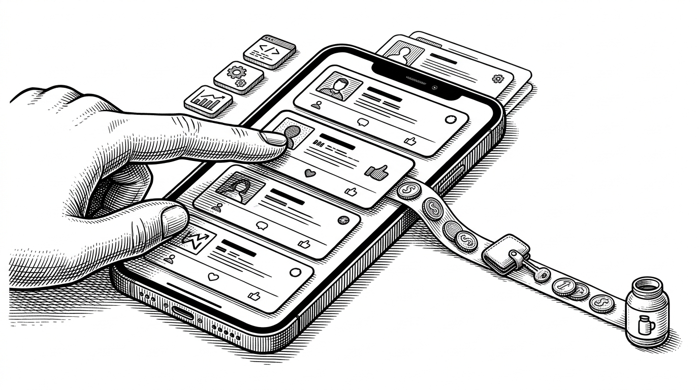
- Swipe-to-tip makes support feel like browsing because discovery and payment share the same gesture.
- Its real architecture win is the handshake between Farcaster identity, secure FID verification, and Daimo-powered checkout.
- The Karma feed shifts attention toward active builders instead of polished fundraising theater.
- The repo is still experimental, but its provider split and route-level plumbing make it easy to harden without changing the product shape.
Most funding tools ask people to stop, evaluate, and then transact. Swipe-to-tip does the opposite. It keeps the social rhythm intact, lets Farcaster users move through Celo projects like cards, then turns a right swipe into a path toward a tip.
The product is the gesture
That sounds simple until you look at the stack. This is not a static demo tucked behind a button. It is a Next.js 14 MiniApp with swipe physics, wallet state, notification plumbing, and a contract workspace sitting next to it in a Turborepo.
The front end pulls from the Karma GAP API and filters for Celo programs. It then orders projects by transaction activity, so the feed favors builders who are already doing work. That is the first real differentiator: the app is not selling attention, it is ranking momentum.
Built as a MiniApp, not a landing page
The MiniApp context matters. The app calls sdk.actions.ready() so Farcaster knows the surface is live, and it also includes a development escape hatch for local testing outside the client. That small detail is a good signal. It means the code is written for the real host environment, not just a browser mock.
The swipe engine is doing more than animation
The heart of the UI lives in the swipe component. Horizontal drag distance becomes rotation and overlay opacity through framer-motion, so the card is not just sliding. It is signaling intent. Once the user commits, the tip path hands off to DaimoPayButton, which hides payment complexity behind a mobile-friendly checkout.
That choice is the right one for this category. If the app had built its own payment logic for every token path, the experience would fracture fast. By leaning on Daimo, the repo keeps the interface light while still supporting Celo-native assets like USDC, cUSD, and CELO.
Verification is the quiet centerpiece
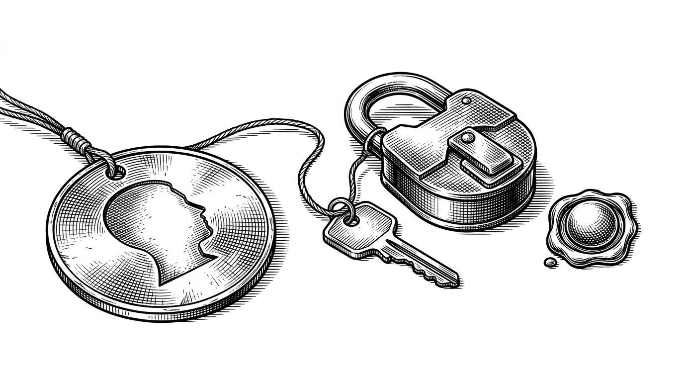
The most security-sensitive part of the repo is not the swipe at all. It is the webhook route that handles Farcaster notifications. Before it stores anything, the app runs a verifyFidOwnership check against the Farcaster KeyRegistry on Optimism through viem. That means the app is not just trusting a claimed identity. It is checking whether the fid actually owns the key tied to the request.
That is a strong pattern for social apps that want to touch money. The current notification store is in-memory, which makes the code feel serverless-ready but still experimental. The nice part is that the boundary is clean. Swapping in Redis or Postgres later would be an infrastructure change, not a redesign.
What this replaces
The closest alternatives are not other swipe apps. They are grant portals, tip buttons, and social feeds that only solve one step at a time. Swipe-to-tip tries to compress all three. It discovers a project, frames the decision, and opens the payment path without making the user leave the gesture.
| Dimension | Grant portals | Tip buttons | Swipe-to-tip |
|---|---|---|---|
| Discovery | Users hunt through forms, categories, and long lists. | Discovery happens elsewhere, then the tip is bolted on. | Discovery and decision happen in the same motion. |
| Payment friction | Multiple screens and context switches are normal. | The transfer is easy, but the path starts after the content decision. | The swipe sets up the checkout path immediately. |
| Identity | Often account-based or manually reviewed. | Usually minimal beyond the host platform. | Farcaster identity is checked before state is trusted. |
| Best fit | Formal allocation rounds and structured programs. | Quick gratitude payments. | Mobile-first ecosystem discovery and support. |
That is why the repo feels bigger than its UI. The monorepo split keeps the front-end experience, the payment abstraction, and the future contract work in separate lanes. The result is an alpha product with sensible seams. It can grow into a more serious funding surface without turning into a rewrite.