legendui-swift: LegendUI: The SwiftUI Kit Where Theme Is the Product
A look at a cross-platform component library that puts semantic colors, layout tokens, and @Observable state at the center of the UI stack.


A description for your component library.
- LegendUI is most interesting as a theme engine with components attached, not as another pile of SwiftUI widgets.
- Its central bet is that semantic tokens, not one-off overrides, should control color, spacing, and typography across the whole app.
- Buttons, chips, and toasts all inherit behavior from the same design substrate, which makes the library feel more like infrastructure than styling.
- The codebase looks early, but the architecture is already disciplined enough to support a serious design system.
Why LegendUI Feels Like Infrastructure, Not a Widget Pack
LegendUI does not read like a library that started with a button and kept expanding. It reads like a theme system that happened to grow components around it. That is the real distinction: the library’s value is less about individual controls and more about how one theme object can reshape the whole UI language.
That matters because SwiftUI already gives you components. What it does not give you is a strong opinionated layer for propagating brand decisions across screens, states, and platforms. LegendUI tries to be that layer.
The Theme Engine Is the Real Product
The architecture centers on SharedTheme, which is built as an @Observable object. That choice is the quiet headline. Instead of pushing theme data through ad hoc environment plumbing, the library treats theme state as something the UI can subscribe to directly.
@Observable
final class SharedTheme {
    var value = LegendTheme()
}

struct LegendTheme {
    var colors = LegendColors()
    var layout = LegendLayout()
    var typography = LegendTypography()
}
That structure gives the rest of the library a clean hierarchy. LegendTheme is the container. LegendColors, LegendLayout, and LegendTypography are the token families. Components consume them downstream, which keeps the styling logic centralized instead of scattered across every view.
| Theme-first LegendUI | Component-first SwiftUI styling |
|---|---|
| One observable theme object drives the system | Each component often carries its own styling logic |
| Semantic tokens encode brand decisions | Appearance is frequently local and ad hoc |
| Layout, typography, and color move together | Spacing and color can drift across screens |
| Buttons and toasts inherit from shared primitives | Every control can become its own special case |
| Cross-platform behavior is part of the theme story | Platform differences are usually handled case by case |
Semantic Colors Turn Variants Into a Language
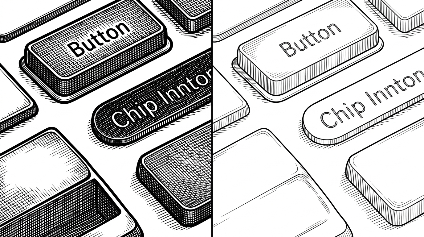
The most revealing idea in LegendUI is the way it handles semantic color groups. The library organizes colors around roles like default, foreground, soft, and softForeground. That is not just naming hygiene. It lets the component system speak in terms of intent.
A soft surface is not a decorative flourish. It is a reusable design primitive. Once that concept exists at the theme layer, buttons, chips, and other controls can shift from solid to soft without changing their structure.
Buttons Show the Architecture at Its Best
Buttons are where the library’s philosophy becomes obvious. LegendUI uses a style system that separates behavior from presentation, which keeps the interaction model clean while still allowing variants, sizes, and custom themes to flow in from the outside.
Button("Continue") { }
    .buttonStyle(
        LegendButtonStyle(
            variant: .primary,
            size: .medium
        )
    )
That is the right abstraction for a theme-first kit. The button is not a special snowflake. It is a consumer of shared tokens, with an escape hatch for custom variants when a product needs something unusual.
| LegendUI button system | Typical SwiftUI button styling |
|---|---|
| Primitive behavior is kept separate from rendering | Behavior and appearance are often bundled together |
| Variants come from a shared theme vocabulary | Variants are frequently reimplemented per screen |
| Custom variants can still fit the system | One-off tweaks can fragment consistency |
| Hover and platform differences are modeled explicitly | Platform behavior is often bolted on later |
Toasts and Overlays Solve the Ugly Part of SwiftUI
The overlay story is practical, and that is why it matters. Toasts are usually where SwiftUI apps start to show seams. LegendUI pushes that problem into a shared overlay layer so notifications can appear without blocking the rest of the interface.
That makes the library more than a visual kit. It becomes a small interaction infrastructure layer, one that can handle passthrough behavior, global presentation, and the awkward parts of transient UI.
Where LegendUI Fits in the SwiftUI Landscape
LegendUI is not trying to replace SwiftUI. It sits above SwiftUI and changes the way a team thinks about brand consistency. Compared with vanilla styling, it is much more opinionated. Compared with many component kits, it starts with the theme and lets the widgets follow.
| LegendUI | Vanilla SwiftUI |
|---|---|
| Theme is centralized and observable | Styling is often distributed across views |
| Semantic tokens drive component variants | Components are styled more locally |
| Layout is part of the design system | Spacing tends to be defined ad hoc |
| Global overlays are first-class | Transient UI usually needs custom plumbing |
| Cross-platform behavior is intentional | Platform-specific polish is often manual |
A Small Project With Serious Architectural Discipline
The codebase looks early, but it does not look careless. The package structure is clean, the theme layer is separated from components, and the presence of docs-oriented conventions suggests someone is building for maintainability rather than a quick demo.
That discipline is the real signal. Even before the project has broad adoption, it already behaves like a serious library: modular, opinionated, and organized around a stable abstraction boundary.