fluid-render-engine: The One-File Fluid Lab That Makes WebGL Feel Like a Product
A raw WebGL simulation, a glassmorphism control panel, and a reactive theme system packed into a single HTML file.

- fluid-render-engine turns a fluid demo into a compact design tool by fusing simulation, controls, and presentation in one HTML file.
- Its biggest trick is not the shader math alone, but the feedback loop that keeps the UI legible while the fluid stays visually alive.
- The project argues that raw WebGL can feel premium when the state model, control surface, and theme system are wired with discipline.
- Compared with heavier engine-driven approaches, it trades generality for immediacy, portability, and a much tighter editing loop.
One file, three jobs
The first surprise here is structural, not visual. This repo does not split itself into a framework app, a shader sandbox, and a UI shell. It keeps the whole thing in index.html, which means the simulation, the controls, and the styling all have to justify their existence in the same room.
That constraint changes the product shape. A separate editor can hide clumsy handoffs between UI state and render state. A single file cannot. Every slider, label, and visual effect has to earn a direct line to the frame it changes.
The real product is the control loop
The repo’s most useful idea is simple: input changes become settings, settings become uniforms, uniforms become a frame, and the frame can feed back into the theme. That last step is what makes this feel like a product instead of a shader toy. The interface does not just sit on top of the sim. It adjusts to it.
That matters because a fluid scene can get visually noisy fast. If the background darkens, blooms, or changes contrast, the UI has to keep its own legibility. The project’s theme switching is not decoration. It is part of the rendering contract.
Why the interface feels expensive

The glassmorphism treatment is doing real work. backdrop-filter, translucent surfaces, and theme variables give the editor a premium shell, but the deeper win is information design. The readouts stay clear, the numbers stay aligned, and the panel remains readable even as the canvas keeps moving.
Small touches matter here. tabular-nums prevents value jitter when the parameters change. Value badges make the controls feel measurable instead of ornamental. That is the difference between a pretty demo and a tool you can actually tune.
Under the hood, the stack stays small
| Layer | What it owns | Why it matters |
|---|---|---|
| UI layer | Controls, labels, theme variables, glass surfaces | Keeps the simulation legible and makes the editor feel like a finished product |
| State layer | Settings object and event handling | Creates a clean path from user input to render parameters |
| Render layer | Raw WebGL, shader uniforms, full-screen quad | Delivers the fluid effect without a heavier framework in the middle |
This is a lean architecture on purpose. The render path is raw WebGL, so the code can push a full-screen quad and let the fragment shader do the work. That keeps overhead low and makes the visual result feel immediate.
The trade-off is obvious. A monolith like this is not a general platform. It is harder to extend, harder to split across contributors, and more reliant on the original author’s discipline. But for a self-contained creative tool, the compactness is the point.
The no-framework bet
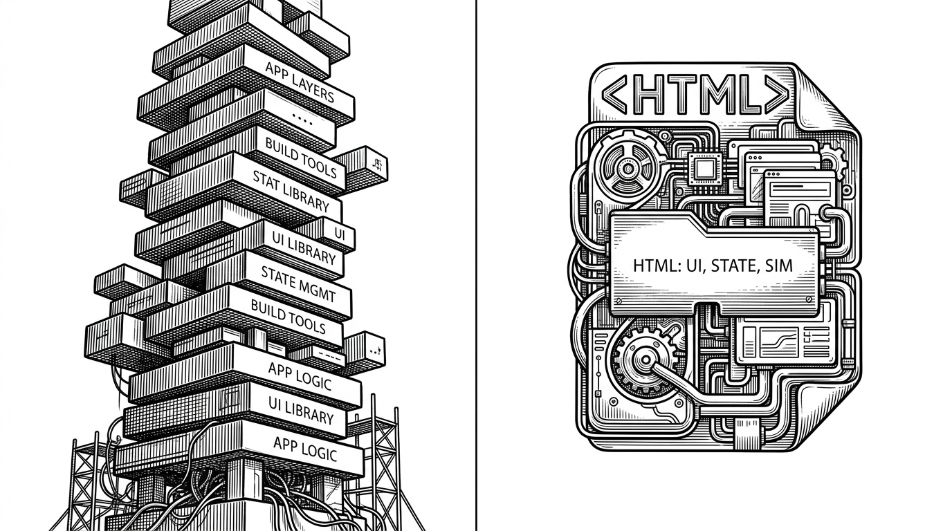
That design choice is a bet on portability. You can inspect it, edit it, and ship it without a build pipeline. For solo builders and small teams, that matters more than theoretical extensibility. The smaller the surface area, the easier it is to keep the interaction tight.
It also makes the repo feel more like an instrument than a library. Libraries invite composition. Instruments invite direct manipulation. This project clearly wants the second path.
What it stands next to
| Project type | Setup cost | Control level | Best for |
|---|---|---|---|
| fluid-render-engine | Low, because everything lives in one HTML file | High, because the editor and the render loop are tightly coupled | A focused creative tool or demo that should feel immediate |
| Babylon.js fluid renderer | Moderate, because it sits inside a larger engine | High, but through engine abstractions | Teams that want a full 3D stack and an established platform |
| Three.js fluid setups | Variable, because the ecosystem is assembled from parts | Very high, but usually assembled manually | Builders who want flexibility and do not mind integration work |
The comparison is not about which project is universally better. Babylon.js and Three.js serve broader worlds. This repo aims at a narrower one: a polished fluid editor that is easy to open, easy to reason about, and visually coherent from first render to final control.
That niche is real. Not every creative tool needs an engine-sized foundation. Sometimes the competitive advantage is a smaller system with fewer seams and a better editing loop.
Why this matters for builders
The lesson here is not that everyone should abandon frameworks. It is that a small, disciplined surface can feel premium when the render path, state model, and interface all move together. The repo turns a technical effect into a usable artifact by refusing to separate the parts that users experience as one thing.
That is a useful model for builders working on internal tools, creative interfaces, and data-heavy visual systems. If the goal is rapid tuning and high trust, a single-file architecture can be a strength. The trick is not size. It is coherence.