gramesh: How a Single Canvas Fakes a Living Mesh Gradient
A zero-dependency gradient studio that uses state syncing, blend modes, and one very smart aurora trick to make simple math look cinematic.
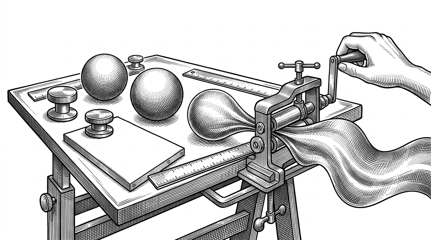
- gramesh makes a polished motion design tool out of a surprisingly small Canvas 2D engine, which is why the project feels larger than its codebase.
- Aurora mode is the article's clearest reveal because it turns ordinary radial gradients into ribbon-like forms with a simple canvas transform.
- The app gets reactive-feeling behavior from one shared state object and a manual node sync step instead of a framework.
- Its real advantage is not maximal graphical complexity, but a disciplined combination of blending, grain, and motion restraint.
The aurora is a cheat, and that is the point
The most interesting thing about gramesh is not that it draws gradients. It is that it makes those gradients feel alive with a tiny set of moves that look almost too simple to matter. Aurora mode is the tell. It does not simulate weather, particles, or volumetric light. It stretches the canvas, lets the circles drift, and lets the eye do the rest.
That is why the project lands as more than a demo. It reads like a solo craft exercise with product instincts. The interface is tidy, the controls are deliberate, and the motion models feel chosen, not piled on.
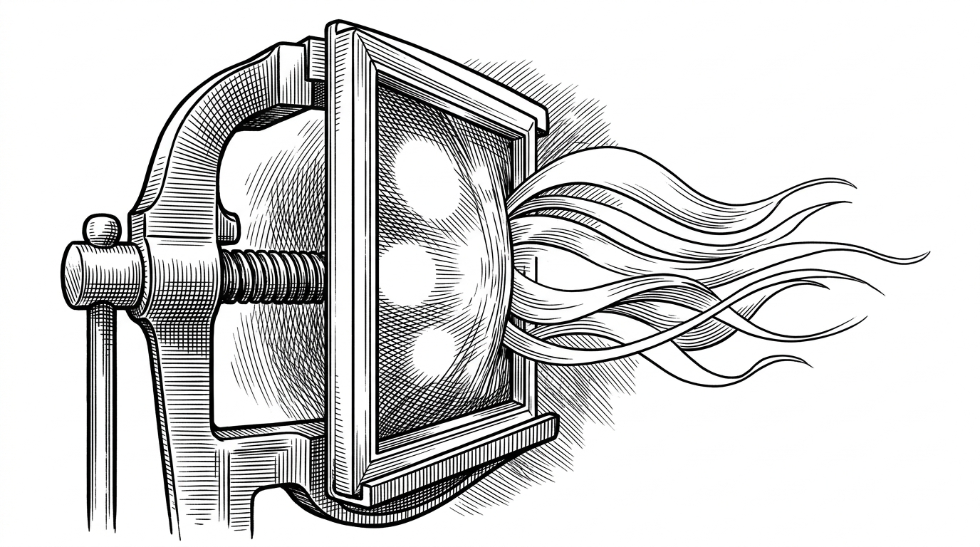
A studio that feels polished without a framework
The codebase is almost defiantly small. It is built around plain JavaScript, Canvas 2D, and CSS variables, with no framework overhead to hide the decisions. That matters because the UI still feels like a real product. The controls have hierarchy, the spacing is disciplined, and the canvas is treated like a first-class surface instead of a rough proof of concept.
const appState = {
  renderMode: 'aurora',
  blend: 'screen',
  palette: defaultPalette,
  nodesData: []
};

function syncNodes() {
  appState.nodesData = appState.palette.colors.map((color, i) => {
    return appState.nodesData[i] ?? new GradientNode(color, i);
  });
}
That little pattern is the backbone of the app. One object owns the state, one sync step keeps the nodes aligned with the palette, and the rest of the system just reads from that source of truth. It is the same basic idea you would expect from a reactive framework, only implemented by hand.
One state object keeps the whole studio in sync
The neat trick is not just that the state is centralized. It is that the rest of the engine stays honest because it is always derived from that state. Change the palette, and the number of nodes changes with it. Change the mode, and the same scene adopts a different motion vocabulary.
function drawFrame() {
  ctx.clearRect(0, 0, canvas.width, canvas.height);
  ctx.save();

  if (appState.renderMode === 'aurora') {
    ctx.scale(1.5, 0.5);
  }

  ctx.globalCompositeOperation = appState.blend;

  for (const node of appState.nodesData) {
    const gradient = ctx.createRadialGradient(
      node.x, node.y, 0,
      node.x, node.y, node.radius
    );

    gradient.addColorStop(0, node.color);
    gradient.addColorStop(1, 'transparent');
    ctx.fillStyle = gradient;
    ctx.fillRect(0, 0, canvas.width, canvas.height);
  }

  ctx.restore();
}
This is where the project stops feeling like a toy. The state model is compact enough to understand at a glance, but rich enough to keep the renderer, the controls, and the visuals in lockstep. That combination is what makes the studio feel dependable.
Three motion modes, three personalities
Fluid, Orbit, and Aurora are not just visual presets. They change how the nodes move through space. Fluid bounces off boundaries. Orbit locks motion into a circle. Aurora streams horizontally, then warps the output by changing the drawing context itself.
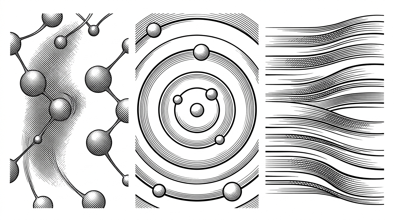
That range is the product design story hiding inside the math. You are not switching themes. You are switching the behavior of the same machine. For a creative tool, that is a much stronger move than adding more controls.
Why the render loop feels expensive when it is not
The premium feel comes from compositing, not brute force. Layered radial gradients give each node a luminous core. `screen` blending lets those cores mix like light instead of pigment. A grain pass then breaks up banding and keeps the image from feeling digitally flat.
const noiseCanvas = document.createElement('canvas');
noiseCanvas.width = 256;
noiseCanvas.height = 256;
const noiseCtx = noiseCanvas.getContext('2d');

function addGrain(targetCtx) {
  targetCtx.save();
  targetCtx.globalCompositeOperation = 'overlay';
  targetCtx.drawImage(noiseCanvas, 0, 0, targetCtx.canvas.width, targetCtx.canvas.height);
  targetCtx.restore();
}
That is a classic low-level win. None of it requires a heavy rendering stack, and none of it asks the user to understand shaders. The result still looks expensive because the author spent effort where perception matters most.
What gramesh beats, and what it does not try to be
| Tool | Setup | Motion | Dependencies | Best at | Trade-off |
|---|---|---|---|---|---|
| CSS gradient generators | Very low | Mostly static or hover-driven | None | Fast backgrounds and quick exports | Limited depth and weak motion control |
| Shader-based editors | Higher | Highly expressive field math | WebGL or shader runtime | Maximum visual complexity | More setup, harder sharing, steeper learning curve |
| gramesh | Low | Fluid, orbit, and aurora modes | None | Editable motion gradients with polish | Less physically exact, narrower scope |
This is the right comparison because it makes the trade-off honest. gramesh is not trying to be the most powerful visual system in the browser. It is trying to be the easiest one that still feels like a serious creative tool.
Why this tiny codebase feels like a product
The best open-source tools are often the ones that make taste look inevitable. gramesh does that by keeping the architecture simple and the experience intentional. The controls are not crowded. The math is not over-explained. The visuals do just enough to feel alive.
That is the real lesson here. A small codebase can still behave like a premium product when the motion model, the compositing, and the UI all serve the same idea. In gramesh, the idea is clear: make simple canvas primitives look like something a much larger system would have produced.