Netflix_clone: The Netflix Replica That Uses URLs as State
A vanilla HTML, CSS, and JavaScript clone that localizes by swapping whole pages, not strings, and gets surprisingly far with simple layout tricks, local assets, and no framework at all.
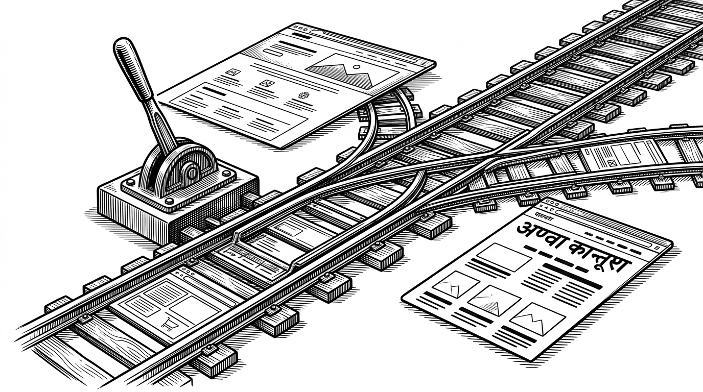
- This clone makes the language selector the router, so localization lives in URLs instead of in a client-side translation layer.
- Its polish comes from simple moves, like duplicated pages, hover motion, modal overlays, and local media assets, not framework machinery.
- The project reads like a regional product sketch for an Indian audience, not a generic Netflix imitation.
- Compared with React and TMDB clones, it trades extensibility for transparency, portability, and low setup cost.
Most Netflix clones try to impress with stack choices. This one is more interesting because it solves a product problem with a simpler mental model. In Ron-Chandrayan's Netflix_clone, the language picker does not rewrite the screen. It moves you to another document, and that choice shapes everything else in the repo.
The router lives in the dropdown
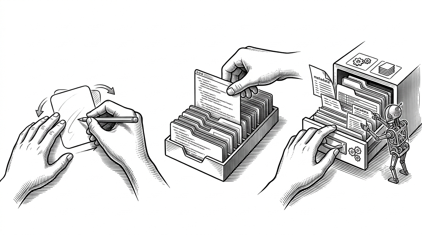
The central trick is almost embarrassingly direct. The language selector uses a one-line navigation change, so the app behaves like a small multi-page product instead of a single-page app wearing a streaming costume. That means the state is carried by the URL, not by a runtime translation layer.
<select onchange="window.location.href=this.value">
  <option value='index.html'>English</option>
  <option value='NetflixHindi.html'>हिंदी</option>
</select>A clone built for a specific audience
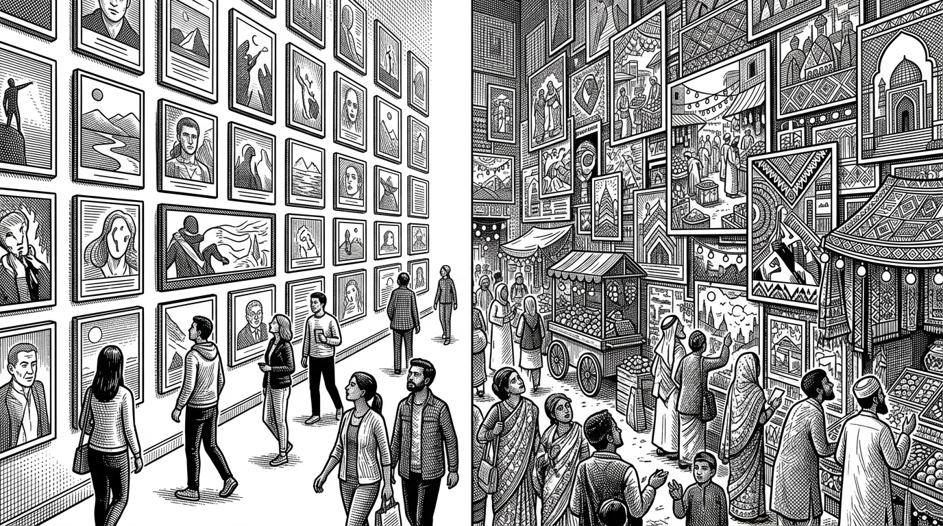
The Hindi landing page is not a novelty side quest. It is a sign that the repo is trying to localize the experience, not just restyle it. The content choices reinforce that reading too, with local titles, Indian pricing cues, and a gallery that feels tuned to a regional audience rather than copied from a global template.
How the landing page cheats well
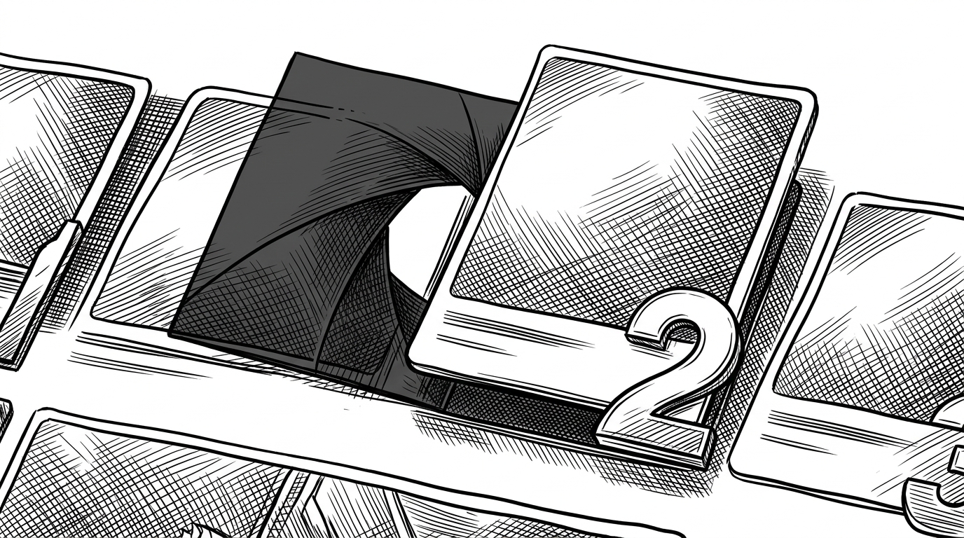
The landing page earns its Netflix resemblance with a few carefully chosen effects. Thumbnails scale on hover, top ten numbering overlaps the cards, and the trending section curves across the page in a way that feels more expensive than the code underneath it. Hidden overlays and fixed-position panels do the rest, giving the interface a sense of depth without adding a framework.
The sign-in flow is just another page
The onboarding path stays consistent with the rest of the repo's philosophy. The landing page hands off to a welcome-back step, then to sign-in, and each stage is its own document rather than a modal state or client-side route. That keeps the implementation easy to follow, and it also makes the project feel more like a small product than a front-end demo.
This is the tradeoff running through the whole repo. Separate pages give up runtime flexibility, but they make the system easy to reason about, easy to host, and easy to inspect. If you are reading the source to understand how the illusion works, that matters.
What this clone gets right, and what it cannot do
Compared with React and TMDB-driven clones, this repo is less ambitious and more legible. It does not promise personalization, live catalog search, or a data pipeline from an external API. What it does promise is a convincing static experience, a clean onboarding path, and enough CSS craftsmanship to make the UI feel real from a distance.
| Dimension | Netflix_clone | Typical React clone |
|---|---|---|
| Routing model | Separate HTML files, with the URL carrying state | Client-side router inside one app |
| Localization model | Duplicate English and Hindi pages | Translate strings in place |
| Data source | Local assets and hand-picked content | TMDB or another remote API |
| Asset strategy | Bundled images and videos in the repo | Remote media or lazy-fetched artwork |
| Setup complexity | No build tool, no framework, static hosting only | React, Vite, or a similar toolchain |
| Maintenance cost | More copy duplication, less runtime complexity | More abstraction, more moving parts |
| Best use case | Portfolio demo, teaching aid, offline-friendly prototype | Extensible app with API integration |
That is why the repository stands out. It does not win by imitating Netflix's backend shape. It wins by choosing a different kind of simplicity, then using that simplicity to get surprisingly close to the feel of a real streaming product.
Why this matters for builders
The lesson is not that frameworks are unnecessary. The lesson is that architecture should match the story you want the product to tell. If your goal is a polished, static, region-aware clone, page duplication and strong CSS can carry a lot more weight than they are usually given credit for.
In other words, the clever part here is not the Netflix imitation. It is the refusal to overbuild it. The repo treats navigation as state, treats localization as a document choice, and treats visual fidelity as a composition problem. That is a useful pattern to remember the next time a project starts to feel like it needs a framework before it has earned one.