ascii-waitlist: A One-File Waitlist That Makes Infrastructure Look Expensive
A single HTML document, a looping WebM, and one state change are enough to sell Arcane as a serious product before the product exists.

- ascii-waitlist turns a waitlist into a brand signal by using atmosphere to sell seriousness before the product is public.
- The repo's power comes from restraint, because one HTML file and one video asset do most of the conversion work.
- The important interaction is a tiny state change, not a large app, and GSAP only has to choreograph the transition.
- The project wins by competing on perception and deployment simplicity, not on waitlist features.
The waitlist that does not look like a waitlist
The first surprise is not the signup box. It is the confidence. ascii-waitlist reads like a launch campaign, with atmosphere doing the work that most waitlists leave to copy and form fields.
That matters because prelaunch infrastructure has a trust problem. Before the product exists, the page has to carry the whole promise, and this one tries to look finished enough to borrow credibility from the future.
Why the repo name is the clue
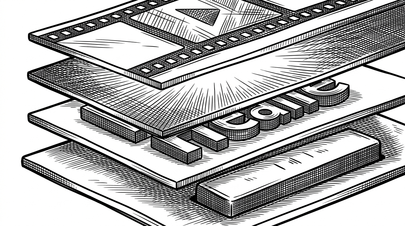
The name points toward ASCII, which suggests something plain, text-first, and almost terminal-like. The implementation goes the other way: layered glow, a looping background video, sharp type, and a page that feels more like a premium product reveal than a utility.
That mismatch is the point. The repo is not trying to be visually literal. It is using a spartan name to frame a highly polished first impression.
One HTML file does almost everything
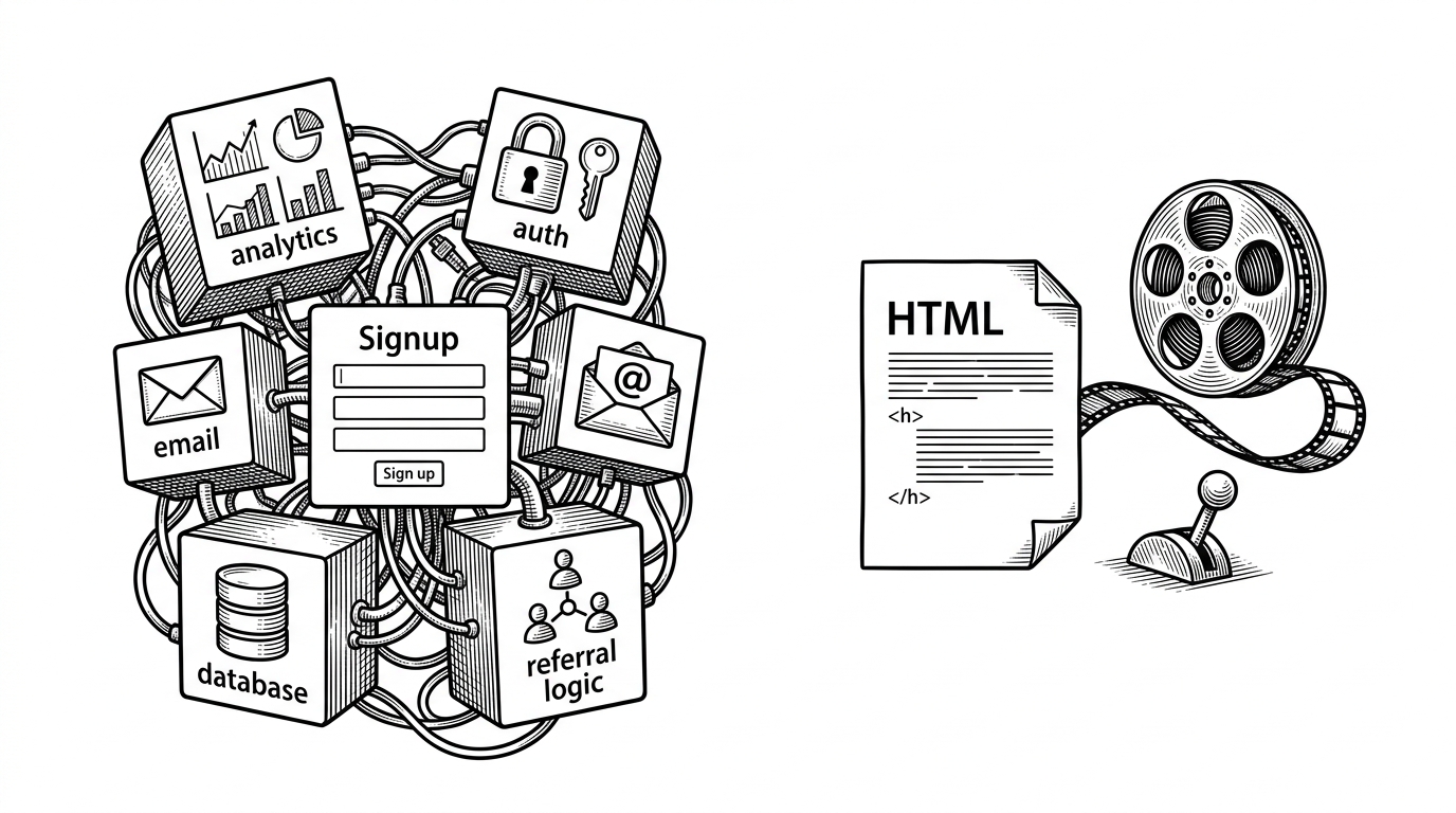
The codebase is almost aggressively flat. index.html carries the markup, the CSS, and the JavaScript. bg.webm is the main separate asset, which makes the whole experience easy to ship on static hosting with no build step in the way.
That simplicity is a strategy, not a compromise. The CSS leans on variables and clamp() for responsive type, while the page stays portable enough to move from local preview to deployment without a toolchain discussion.
ascii-waitlist/
├── index.html  # markup, styles, state, animation
└── bg.webm     # ambient loop
That is the real win. There is almost no architecture to get wrong, so the page can focus on presentation and transition instead of plumbing.
The real trick is the state change
The interesting interaction is not a complex workflow. It is a small switch from the waitlist view to the greeting view. A class such as view-greeting can flip opacity and pointer-events, and GSAP can choreograph the timing so the change feels like one smooth motion.
That is a useful pattern for launch pages. When the product is still under construction, the UI only needs to prove that the team can handle one clear promise, one input, and one satisfying result.
The diagram also shows why the page feels larger than it is. Most of the perceived richness comes from layers, timing, and contrast, not from a long chain of application logic.
Atmosphere is doing product work
The ambient video is not decoration. It creates motion without asking the user to do anything, which makes the page feel alive even before the form is touched. The glow layers and noise treatment do the same job at a different scale: they make flat surfaces feel deeper and more expensive.
Typography does the rest. Inter keeps the UI clean, JetBrains Mono gives it a technical accent, and the responsive headline sizing lets the copy stay strong without a pile of media queries. The result is a page that signals engineering seriousness without looking cold.
How it compares with other waitlist patterns
On feature checklists, this repo loses. It does not chase referrals, wallet verification, or a backend-heavy pipeline. On first impression, it wins because it spends its complexity budget on trust, motion, and launch polish instead of mechanics most visitors never see.
| Project type | Stack complexity | What it optimizes | Where ascii-waitlist stands |
|---|---|---|---|
| Referral-heavy waitlist | High | Virality, identity, leaderboard loops | Stronger on brand mood and lower operational weight |
| Headless API waitlist | Medium to high | Integration, validation, email flows | Stronger on immediacy and presentation |
| Spreadsheet-backed waitlist | Low | Cheap collection and fast setup | Stronger on trust signal and launch polish |
| ascii-waitlist | Very low | Perception, portability, and speed to publish | It is the front door, not the platform |
That makes it closer to a brand surface than a waitlist product. The signup is real, but the deeper job is to make a not-yet-public infrastructure tool feel ready for serious attention.
What this repo is actually for
This repo is for early technical products that need to signal competence fast, especially when the backend story is still private. It is a strong fit for founders who want the landing page to carry more weight than the implementation would suggest.
The lesson is bigger than one waitlist. If the visual system is disciplined enough, a tiny frontend can do the job of a much bigger launch stack. Here, the page is not a wrapper around the product. It is the first version of the product people experience.