kross-template: the landing page template that behaves like a stage crew
A monochrome Next.js starter that uses one client-side orchestration layer to control preload, scroll motion, texture, and timing like a carefully cued performance.
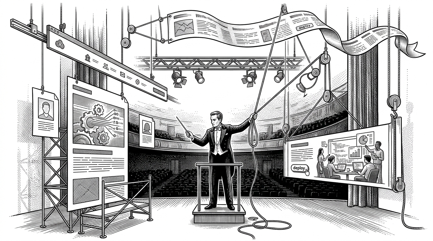
- kross-template turns a landing page into a timed performance, with one client-side controller staging preload, reveal, scroll reactions, and cleanup.
- Its premium feel comes from discipline, not decoration: monochrome restraint, grain, and fluid type do the heavy lifting.
- The motion language responds to user behavior, so nav visibility and marquee skew feel physical instead of canned.
- The template sits between generic starters and custom agency builds, trading some simplicity for a reusable boutique system.
A template that starts like a performance
Most landing page starters show you sections. kross-template shows you timing. The page feels directed: a preloader resolves, navigation behaves like a cue-based overlay, and motion arrives in sequence instead of as a pile of effects.
That matters because the first impression is not visual polish alone. It is the feeling that everything is moving under one hand, with each beat waiting for the last one to finish.
One component conducts the whole page
In KrossPage.js, the interesting move is architectural. Instead of scattering animation setup across many components, the page centralizes initialization in one client-side boundary, then fans out into section-specific functions like initNav, initHero, initWork, and initMarquee.
That makes the file read like a stage manager's checklist. It also keeps the cleanup story simple, because the GSAP context can be reverted when the component unmounts.
useEffect(() => {
  const ctx = gsap.context(() => {
    const initPage = () => {
      initNav();
      initHero();
      initWork();
      initMarquee();
    };

    const tl = gsap.timeline({
      onComplete: initPage
    });

    // preload and reveal steps live here
  });

  return () => ctx.revert();
}, []);
Why the monochrome look feels expensive
The palette is strict for a reason. Black text on white space forces hierarchy to come from proportion, spacing, and timing. That restraint is what makes the grain overlay and typography scale feel deliberate instead of decorative.
The CSS does a lot of quiet work: design tokens keep the system consistent, clamp() keeps headings expressive across viewports, and a faint noise layer breaks the flatness without breaking the discipline.

:root {
  --bg: #fff;
  --text: #111;
  --text-mid: #666;
  --border: #e5e5e5;
}

.hero-title {
  font-size: clamp(3.5rem, 9vw, 8rem);
  line-height: 0.92;
  letter-spacing: -0.06em;
}

.grain {
  opacity: 0.025;
  pointer-events: none;
}
The motion grammar: hide, reveal, skew, settle
The site keeps repeating a few motions, and that repetition becomes the language. The nav hides on scroll down and returns on scroll up. The marquee skews with velocity. Even small gestures feel physical because the animation is responding to input, not just playing on a timer.
That is the deeper value of GSAP here. It is not just smoother animation. It is a way to couple page state to user behavior without making the whole template feel like a demo reel.
let lastY = 0;

ScrollTrigger.create({
  start: 0,
  end: "max",
  onUpdate(self) {
    const y = self.scroll();
    nav.classList.toggle("is-hidden", y > lastY);
    lastY = y;
  }
});

ScrollTrigger.create({
  onUpdate(self) {
    const velocity = self.getVelocity();
    gsap.to(".marquee-content", {
      skewX: gsap.utils.clamp(-3, 3, velocity / 600),
      overwrite: true
    });
  }
});
What this beats, and what it does not
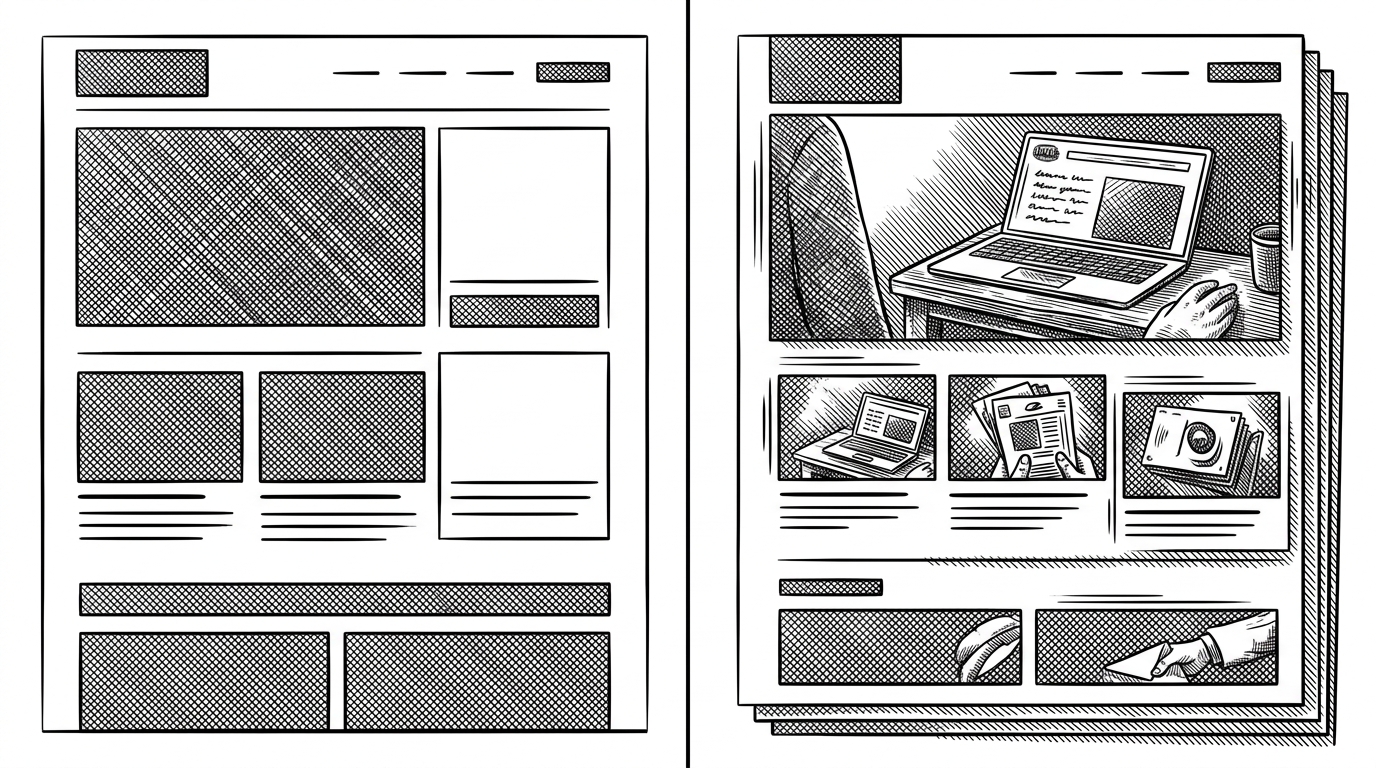
Compared with a generic starter, kross-template gives you a point of view. Compared with a fully custom agency build, it gives you a reusable system. The trade-off is obvious: the template is opinionated, and the client-side motion layer is part of its identity.
That is not a bug. If you want a static foundation, there are easier paths. If you want a boutique feel without inventing the choreography from scratch, this is the middle ground.
| Dimension | Generic starter | kross-template | Custom agency build |
|---|---|---|---|
| Motion handling | Minimal or none | Centralized GSAP orchestration | Custom, hand-tuned |
| Visual system | Standard defaults | Monochrome, grain, strong typography | Fully bespoke branding |
| Setup complexity | Low | Moderate | High |
| Reusability | High but bland | High with personality | Low to moderate |
| Trade-off | Fast, forgettable | Opinionated, client-side heavy | Costly and slow to reproduce |
| Best fit | Internal pages, prototypes | Creative studios, boutique brands | Flagship launches |
The repo as a productized aesthetic
Built by Leonxlnx, the repo reads like a packaged taste profile for teams that want a specific editorial look without rebuilding the motion system every time. It turns visual discipline, motion timing, and page lifecycle handling into something reusable.
The smartest line in the code is not a dramatic animation call. It is the discipline of having one place where the page is initialized, animated, and torn down. That is what makes the template feel less like a theme and more like a directed scene.