smooth-ui-components: SmoothUI: The Animated Component Library Built for Humans, Agents, and shadcn Workflows
A close look at how SmoothUI packages motion, Tailwind, and copy-paste ergonomics into a system that feels designed for modern frontend teams and AI-assisted coding.
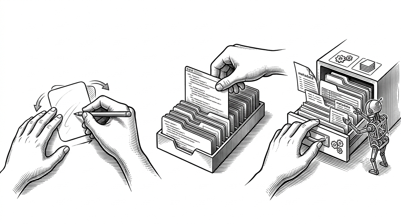
- SmoothUI’s real product is not just animated components, but a distribution model that makes motion feel installable and legible to humans and tools.
- Its edge comes from combining shadcn-style copy-paste ergonomics with a machine-readable catalog and public API.
- The motion stack matters because it turns polish into a repeatable system rather than a pile of one-off effects.
- SmoothUI is most compelling for teams that want expressive UI without leaving the familiar Tailwind and React workflow.
There is a small sourcing problem at the center of this story: the repo name in the brief points to Leonxlnx/smooth-ui-components, but the project that actually exists in the research is SmoothUI. That mismatch matters, because it changes the article from a static HTML gallery into something more interesting: a motion-heavy React system that tries to be readable by people, easy to copy, and structured enough for AI-assisted workflows.
The New Job of a UI Library
I’m building `SmoothUI`, an open-source library of copy-paste `React` components focused on beautiful micro-interactions.
That line gets to the point. SmoothUI is not trying to win by being the biggest catalog. It is trying to make animated UI feel like infrastructure: something you can discover, inspect, install, and reuse without breaking the workflow.
That is a subtle but important shift. In the shadcn world, the distribution model is part of the product. SmoothUI extends that idea by wrapping motion, metadata, and installability into the same package, so the component is never just a visual asset.
Why SmoothUI Feels Different from a Typical Component Kit
SmoothUI sits on a familiar stack: React components, Tailwind CSS v4, Motion, and GSAP. The difference is not that each ingredient is rare. The difference is that the project is opinionated about how animation should feel and how it should ship.
Motion handles the reactive, declarative side of interaction. GSAP gives more precise control where timing and choreography need extra polish. Tailwind keeps the styling close to the markup, which matters in a copy-paste library because readability is part of the value proposition.

The Hidden Product Is the Catalog
This is the part that makes SmoothUI feel more forward-looking than a normal component kit. A machine-readable catalog changes the user from someone browsing a gallery into someone operating a system.
For a human, that means faster discovery. For an AI agent, it means the library is not just visible on a page. It has enough structure to be queried, routed, and turned into an action. That is a very different kind of frontend surface area.
This is also why the public API matters. A library with an API is saying the catalog is not a marketing layer. It is a product surface, which makes automation a first-class use case instead of a hack.
Motion as a System, Not an Effect
The best animated UI libraries do not feel animated because every element is flashy. They feel animated because the timing language is consistent. SmoothUI appears to lean into that idea by pairing reusable motion primitives with a coherent visual system.
That matters in practice. A library becomes noisy when each component invents its own personality. A motion system becomes useful when hover, entrance, state change, and exit all feel like they belong to the same family.
The editorial tell here is the restraint. SmoothUI’s motion story is not about spectacle. It is about making interaction feel intentional enough that a team can ship it repeatedly.
Where SmoothUI Fits in the Animated UI Landscape
| Project | Strength | Best for | Trade-off |
|---|---|---|---|
| SmoothUI | Motion-rich copy-paste components with catalog and API structure | Teams that want polished UI and AI-friendly discovery | Smaller breadth than the largest libraries |
| Eldora UI | Large animated catalog | Teams optimizing for volume and quick browsing | Less focused on machine-readable workflow |
| uselayouts | Next.js-oriented component set | Projects deeply tied to Next.js conventions | Narrower scope and less general-purpose |
| MeetUI | Experimental motion and 3D-heavy interactions | Products that want visual drama | Heavier motion language and more complexity |
| shadcn/ui | Baseline copy-paste ergonomics | Teams that want maximum simplicity and control | No native motion story |
The comparison is not really about who has the most components. It is about philosophy. SmoothUI is more opinionated than shadcn/ui, less maximal than the biggest catalogs, and more automation-friendly than a typical animation library.
Who Should Use This, and Who Shouldn’t
- Choose SmoothUI if you want motion-heavy components without leaving the shadcn-style copy-paste workflow.
- Choose it if your team cares about discoverability, cataloging, and agent-friendly structure.
- Skip it if you want a huge generic library and do not care about animation language.
- Skip it if your design system requires absolute visual neutrality and minimal motion.
That leaves SmoothUI in a clear lane. It is not the default choice for every team. It is the choice for teams that think motion is part of the interface contract, not decoration on top of it.
That is also why the AI angle is more than a buzzword here. If a library is already organized for browsing, installation, and reuse, then machine discovery is a natural extension of the product, not a separate feature request.