blood_bank_portal: BloodBank Student Portal: When CSS Tries to Turn Donation Into a Reward Loop
A no-framework blood donation portal that uses animated cards, modal flows, and certificate reveals to make a prototype feel like a product before any backend exists.

- BloodBank Student Portal is persuasive because it stages trust and reward in the browser before it proves any backend depth.
- Its strongest move is not data handling, but the way vanilla HTML, CSS, and JavaScript simulate a finished product through motion and state changes.
- The certificate flow is the emotional core of the repo because it turns a utilitarian action into a visible payoff.
- The project reads like a prototype argument: if the interface feels real enough, the missing system can be added later.
The portal sells a feeling before it stores a record
The most interesting thing about getchaviral/blood_bank_portal is not that it is a blood bank app. It is that it behaves like a finished product while remaining very obviously a front-end prototype. The interface keeps pushing one idea: donation should feel rewarding, immediate, and student-friendly.
That matters because the project’s center of gravity is emotional design, not database design. The portal frames blood donation as something you complete, celebrate, and remember, with certificates and animated transitions doing the heavy lifting. In that sense, the UI is the product hypothesis.
A flat, modular front end disguised as an app
The codebase is a clean example of flat web architecture. Instead of a framework, it uses plain HTML, CSS, and JavaScript files organized around individual tasks like user entry, certificate display, and logout confirmation. That keeps the repo easy to read, and it also keeps the illusion intact, because every screen can be tuned independently.
| Dimension | BloodBank Student Portal | Conventional blood bank system |
|---|---|---|
| State handling | Client-side class toggles and modal logic | Server-backed sessions and records |
| Persistence | Mostly volatile in the browser | Database-driven and durable |
| Visual engagement | High, with animated cards and reveal effects | Usually functional first, decorative second |
| Setup complexity | Low, because there are no framework or package dependencies | Higher, because backend, auth, and storage must all be wired up |
| Prototype speed | Fast, because screens can be built as standalone files | Slower, because each feature needs infrastructure |
| Real-world readiness | Good as a concept demo | Expected to support operations and auditability |
The real trick is browser-native state
The technical surprise is how much the portal gets out of native browser behavior. Form submission is intercepted with preventDefault(), UI pieces appear and disappear through CSS classes, and card flips lean on transforms instead of a heavy animation library. That gives the app a sense of structure without forcing it into a framework shape.
form.addEventListener('submit', function (event) {
  event.preventDefault();
  successMessage.classList.remove('hidden');
  successMessage.classList.add('show');
  form.reset();
});

logoutButton.addEventListener('click', function () {
  modal.style.display = 'block';
});

window.onclick = function (event) {
  if (event.target === modal) {
    modal.style.display = 'none';
  }
};
That pattern is simple, but it is also strategic. By moving state into CSS classes and event handlers, the repo makes interaction feel fluid even when the underlying data model is thin. The interface does not need to prove persistence in order to prove intent.
The certificate flow is the product’s emotional core
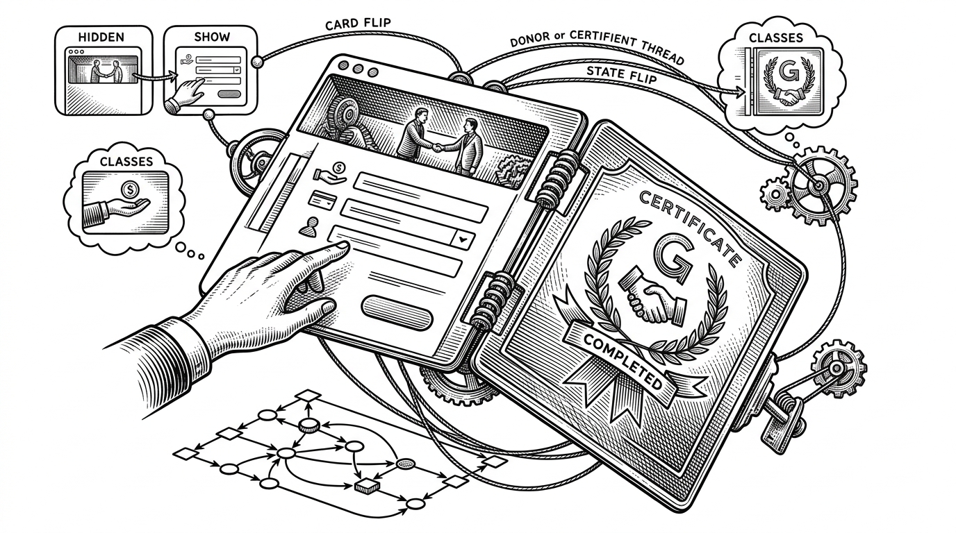
The certificate experience is where the project stops looking like a utility and starts looking like a reward loop. A completed action is not left hanging in the interface. It is turned into a visible payoff, which makes the whole portal feel less bureaucratic and more motivating.
| Certificate flow | What it does |
|---|---|
| Hidden container | Keeps the reward out of view until the interaction is complete |
| Reveal animation | Turns completion into a moment, not just a state change |
| Button emphasis | Pulls attention toward the payoff instead of the form |
That is a smart product instinct. In student-facing software, the reward has to be legible fast. The certificate is not decoration here. It is retention design.
What the app does not do yet is the whole point
The missing pieces are as revealing as the working ones. There is no durable persistence layer, no visible validation depth, no real AI matching engine, and no serious role separation between user and admin. In a finished system, those omissions would be defects. In this repo, they read more like proof that the front end is the primary argument.
That is why the “ghost AI” idea matters. The project’s framing suggests prediction and matching, but the source you can actually inspect is mostly interface choreography. The code is saying, in effect, that the experience can be prototyped before the intelligence arrives.
| Claimed system | Observed repo |
|---|---|
| AI matching | No visible model or inference layer |
| Donation tracking | Mostly simulated in the browser |
| Admin workflow | Merged into a simplified client-side experience |
| Operational database | Not present in the surfaced code |
Vanilla JS is the constraint, and the advantage
The stack choice is part of the thesis. Zero dependencies keeps the project portable, easy to inspect, and quick to extend. That is a real advantage when the goal is to prototype trust, motion, and reward rather than ship a production system.
The trade-off is equally clear. A light stack can make a concept feel immediate, but it cannot fake operations forever. At some point the backend has to show up, or the portal remains a very polished promise.