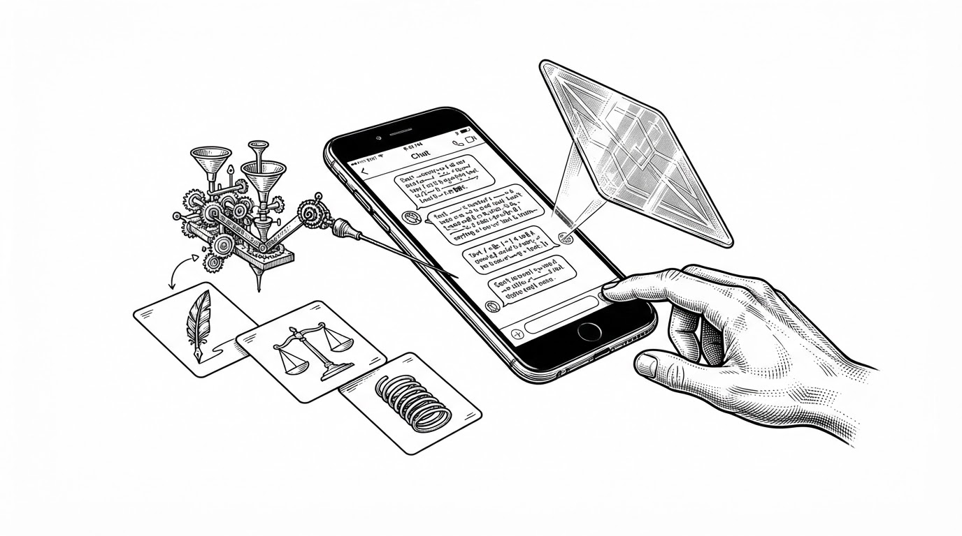
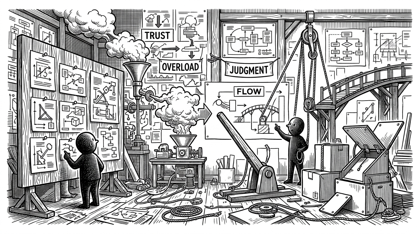
SPOTTO: The parking app that turns streets into a probability map
A Flutter prototype that predicts where you can stop, redraws the map around your position, and hands off to navigation only when the decision is made.
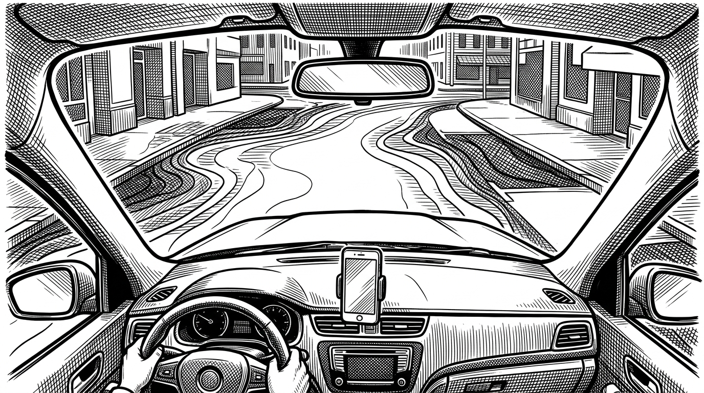
- SPOTTO treats parking as a live probability field, not a static directory of lots.
- Its regeneration loop and timer-driven updates make a synthetic map feel local.
- The UI compresses uncertainty into glanceable cards and a one-gesture handoff.
- The project's real bet is that navigation software should help drivers decide before it tells them where to go.
Parking, but forecasted
Most parking apps answer a small question badly: where is the nearest place to leave the car? SPOTTO asks a better one. Where is parking likely to be right around me, and how quickly can the interface turn that uncertainty into a decision?
That shift sounds subtle, but it changes the whole product. A list of lots becomes a moving local field, and the map stops acting like a directory. It starts acting like a driver aid.
The trick behind the live map
The core trick is not a giant backend marketplace. It is a local loop. In lib/screens/map_screen.dart, the map rebuilds its parking context after movement crosses a threshold, then a timer keeps nudging probability values so the screen feels alive instead of frozen.
The result is a believable parking forecast even when the app is working from mock data. Coordinate shifting makes the demo feel local, so the user sees a neighborhood that reacts to motion rather than a static set of test pins. That is why the experience reads as responsive, even before you ask how the data is sourced.
How the app works under the hood
The codebase is organized like a real product, not a throwaway demo. Models live in lib/models, screens in lib/screens, services in lib/services, and shared UI pieces in lib/widgets. That structure matters because the app is trying to separate map behavior, navigation handoff, and presentation instead of letting everything collapse into one screen file.
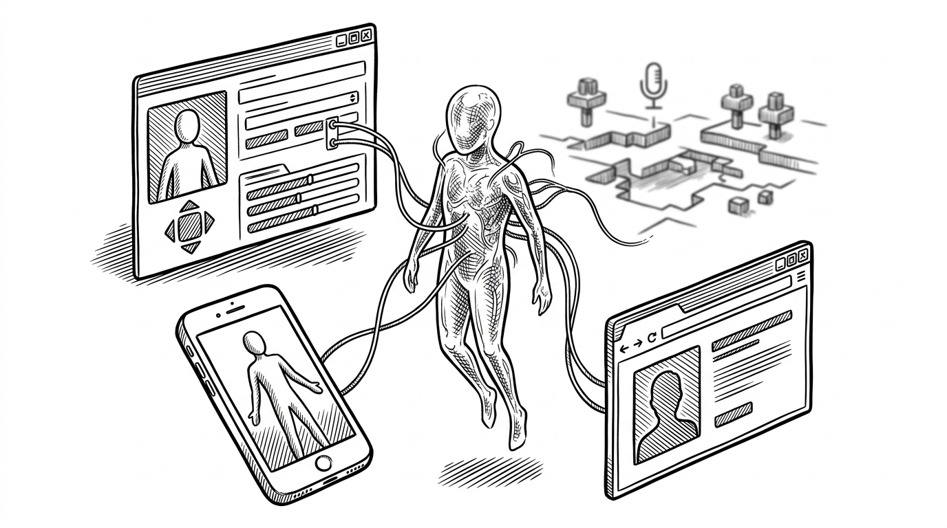
The technical stack fits the job. flutter_map renders the map, geolocator and geocoding provide location and address context, fl_chart draws history, and url_launcher lets NavigationService hand off to Google Maps, Apple Maps, or Waze. The interesting part is the model layer: ParkingZone stores polygon boundaries and a probability score, so SPOTTO can color whole curb regions instead of dropping a single pin.
There is also lifecycle discipline in the prototype. WidgetsBindingObserver helps pause GPS work when the app backgrounds, and the proximity logic keeps the experience responsive without pretending it is a full cloud service. That is a good sign. The code knows which problems belong in the product and which ones belong in the platform.
Why the UI feels built for a driver
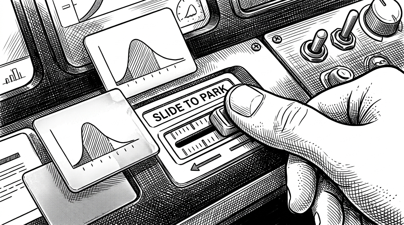
The Neo-Logistics palette and bento layout are not decorative fluff. They are doing product work. The header dims while the map is being dragged, which tells your eyes to focus on the street, not the chrome. The frosted probability cards and the chart under glass turn messy uncertainty into something you can process at a glance.
Then there is the gesture design. Slide to Park is a strong choice because it replaces a mode switch with a deliberate action. That is exactly what a driver needs. A fast commitment, not another screen to study.
A prototype with product instincts
SPOTTO reads like a polished prototype with real discipline behind it. The folder structure is clean, the service boundaries are obvious, and the mock data is not just placeholder noise. It is carefully shifted so the app feels local, which is a smart way to test a location product before you have a live backend worth trusting.
That also reveals the project's current bet. It is not trying to be a full parking marketplace yet. It is trying to prove a mental model: if you can make parking feel like a live system instead of a search task, the rest of the experience becomes easier to design.
SPOTTO vs. the usual parking stack
Most navigation tools optimize the trip. Most parking tools optimize inventory. SPOTTO sits between them, and that is what makes it interesting.
| Product type | Primary question | Unit of information | What the driver gets |
|---|---|---|---|
| Navigation app | How do I get to the destination? | Route and pin | Arrival first, then a separate parking problem |
| Parking marketplace | Where can I reserve a space? | Listing and reservation | A guaranteed spot, often before arrival |
| SPOTTO | Where is parking likely to be near me right now? | A local probability field | A faster choice, then an external handoff |
What this project is betting on
The broader thesis is bigger than parking. SPOTTO argues that mobility software should behave less like a directory and more like an instrument panel, continuously converting spatial uncertainty into one usable next action. If that idea sticks, the winning interface will not be the one with the most pins. It will be the one that makes the next decision obvious.