OriginN: The Portfolio Template That Turns a Contact Page Into a Client Intake System
A high-end React site that pairs Awwwards-style presentation with zero-backend onboarding, CSS-only 3D motion, and a data-driven architecture built for solo agencies.
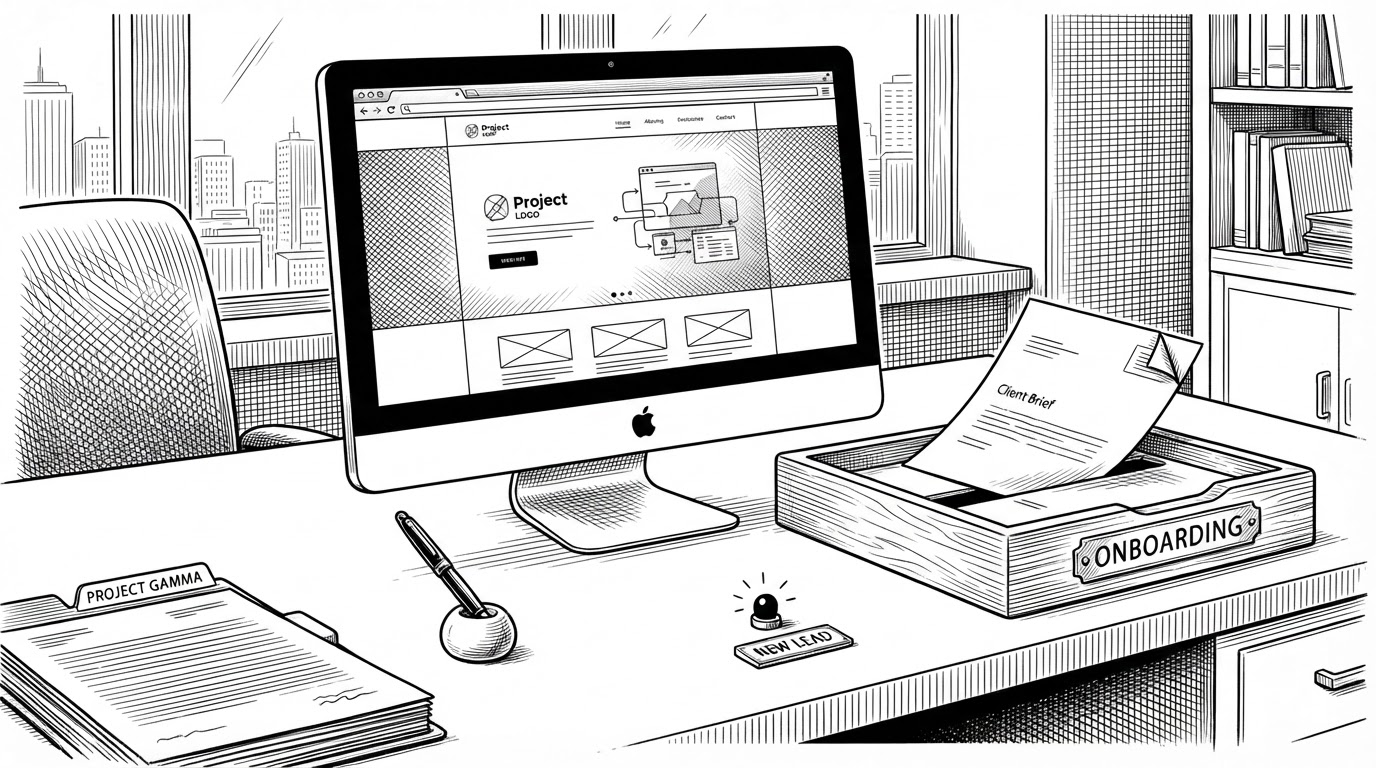

Architected and developed a premium interactive web platform with an emphasis on state-of-the-art UI/UX design, smooth page transitions, and highly responsive digital environments.
- OriginN’s real differentiator is that it turns a portfolio into the first stage of client onboarding.
- The Client Portal matters more than the hero animation because it replaces a dead-end contact form with a structured lead path.
- The site looks expensive without leaning on heavy WebGL because its motion and 3D effects are built from disciplined CSS and theme variables.
- The codebase is designed like a reusable template, so the visual polish stays maintainable for solo freelancers and small studios.
Most portfolio templates are optimized for admiration. OriginN is optimized for action. The moment that tells you this is the Client Portal, because it treats a visitor like a prospective client and starts gathering the right information before any human replies.
The portfolio that behaves like a funnel
That shift matters. A normal contact page says, “reach out if interested.” OriginN says, “let’s begin onboarding now.” It is a subtle change in interface, but a major change in business intent.
| Template type | What it does | What it misses | OriginN’s position |
|---|---|---|---|
| Standard portfolio | Shows work and offers a contact form | Stops at inquiry | Replaces the form with structured intake |
| Immersive showcase | Wins attention with motion and effects | Can ignore conversion | Keeps the polish, adds workflow |
| Heavy 3D stack | Delivers spectacle and depth | Adds complexity and runtime cost | Uses CSS for high-end motion instead |
Why the Client Portal matters more than the hero animation
The portal is the project’s sharpest move because it makes the site operational. A visitor enters a multi-step onboarding flow, submits the form through FormSubmit, then returns to the app with state encoded in the URL. The success banner appears because the app detects submitted=true on the way back.
That is what makes the project feel less like a theme and more like a lightweight agency operating system. It handles lead capture, qualification, and confirmation without asking the owner to build an API first.

How OriginN keeps the experience feeling expensive
The 3D hero is built with CSS transforms, not a heavy scene graph. That matters because the effect is visual, but the implementation stays light. The same idea shows up in theming: CSS variables handle the design system, and a blocking script sets the theme before React mounts to avoid a flash of the wrong palette.
The architecture underneath the polish
The codebase follows a simple pattern: route-based pages, reusable components, and typed data maps where content changes by route instead of by duplicated layouts. That is especially clear in the service pages, where a serviceData object drives the content for each offering.
const serviceData = {
  'website-development': {
    title: 'Website Development',
    price: '$2,500',
    features: ['Responsive design', 'Fast loading', 'CMS setup']
  },
  'logo-design': {
    title: 'Logo Design',
    price: '$450',
    features: ['Brand discovery', 'Concept rounds', 'Vector delivery']
  }
};

const { serviceId } = useParams();
const service = serviceData[serviceId as keyof typeof serviceData];| Layer | What it does | Why it helps |
|---|---|---|
| React pages | Own the route-level experience | Keeps the site modular |
| TypeScript | Types the data and props | Reduces drift in a template meant to be reused |
| Component CSS | Scopes styles to each unit | Makes the design easier to port and edit |
| Route mapping | Selects content from data | Avoids duplicate page shells |
This is a practical template, not a novelty demo. The interesting thing is that the visual ambition does not collapse the maintainability. The structure stays legible because the interactions are built from common web primitives.
What OriginN is really competing with
OriginN sits between three familiar categories. It is more operational than a standard portfolio, lighter than a Three.js-heavy immersive site, and more maintainable than many animation-first showcases.
| Category | Strength | Weakness | Where OriginN lands |
|---|---|---|---|
| Standard React template | Fast to ship | Often generic | OriginN adds a real onboarding path |
| Awwwards-style showcase | Strong first impression | Can ignore utility | OriginN keeps the spectacle but adds conversion |
| Three.js portfolio | Deep visual impact | Heavier stack and runtime | OriginN gets the feel with CSS instead |
That middle position is the point. It is not trying to be the most technically extreme thing on the page. It is trying to be the most useful site a solo freelancer can have when a lead lands and decides whether to keep going.
Who should build from this pattern
The best fit is a solo freelancer, boutique studio, or design-minded developer who needs credibility and conversion in the same package. If your website is expected to start a project, not just advertise one, OriginN’s model makes sense.
- Use the template when your site needs to qualify leads before you reply.
- Use it when you want premium motion without adopting a heavier 3D runtime.
- Use it when maintainability matters as much as visual presentation.