volumetric-fluids: The Shader Gallery That Makes Volumes Look Easy
A single-file WebGL project uses noise, raymarching-style tricks, and a clean light-mode palette to turn fluid rendering into a portable design artifact.
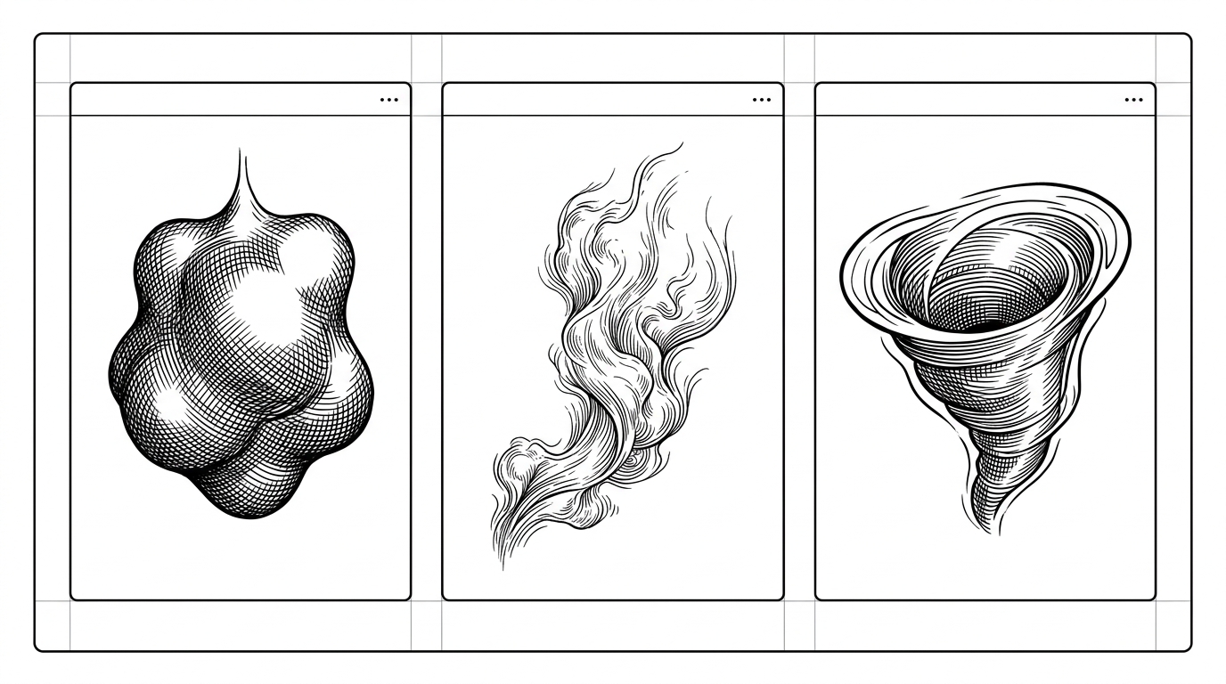

A collection of clean volumetric 3D fluids rendered entirely in WebGL shaders.
- volumetric-fluids sells depth as an illusion, not a simulation, and that makes the project feel both elegant and portable.
- The gallery format matters because it turns shader experiments into a browsable artifact that reads like a product.
- Its core lesson is technical restraint: a small WebGL pipeline, a few uniforms, and layered noise can produce convincing softness.
- The repo stands apart by treating light mode as a design constraint instead of a compromise.
The trick is not simulation. It is a controlled illusion. volumetric-fluids looks like a compact gallery of expensive fluid renders, but the point is that the visuals are built from a disciplined WebGL setup, not a heavyweight physics engine. That is the appeal: a browser can suggest depth, softness, and density with far less machinery than the image implies.
A collection of clean volumetric 3D fluids rendered entirely in WebGL shaders.
Why this gallery feels like a product, not a demo
The first smart move is presentation. The shaders are framed as cards in a responsive grid, so the page reads like a curated interface instead of a dev sandbox. That changes the mental model immediately: you are not inspecting a proof of concept, you are browsing a usable visual system.
<button class="download">Download current shader</button>
<canvas id="view"></canvas>

<script>
  const uniforms = {
    u_time: { value: 0 },
    u_resolution: { value: [width, height] },
    u_bg: { value: [1.0, 0.98, 0.96] },
    u_c1: { value: [0.93, 0.75, 0.68] },
    u_c2: { value: [0.82, 0.54, 0.50] },
    u_c3: { value: [0.58, 0.34, 0.36] }
  };
</script>
The export path is the other product decision. Instead of leaving the effect trapped inside the page, the repo supports a standalone flow that wraps the shader and its parameters into a downloadable artifact. That makes the gallery feel less like a gallery and more like a transfer format for visual ideas.
How the shader pipeline creates softness
The technical core is simple in structure and rich in effect. A full-screen quad hands the fragment shader every pixel, and the shader decides what that pixel should become based on time, resolution, uniforms, and layered noise. The illusion of volume comes from treating the pixel field as a sampled medium rather than a flat canvas.
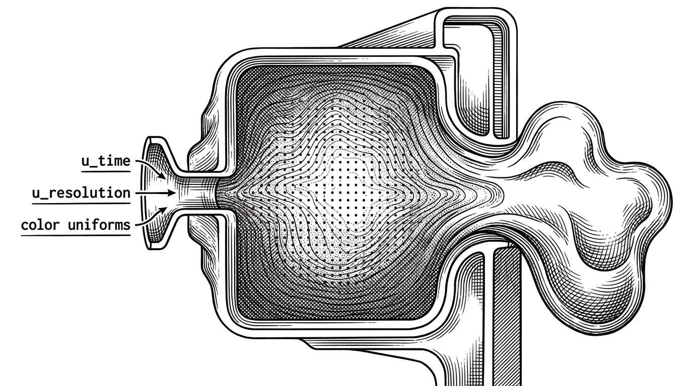
That softness usually depends on layered sampling, not a literal fluid solver. In projects like this, the shader often uses simplex noise, repeated field queries, and a careful blend of background and body colors to simulate absorption and internal glow. The result is less about accuracy than about believable mass.
The code architecture reinforces that idea. JavaScript is mostly a thin runtime that compiles the shader, passes uniforms each frame, and keeps the canvas responsive. Most of the visual intelligence lives where it should: inside GLSL, close to the pixels.
Why light mode is the harder aesthetic
Most shader art cheats in the opposite direction. Black backgrounds hide seams, and neon color can mask weak structure. This repo does the harder thing and puts the effect on a bright interface, where edges, contrast, and color relationships have nowhere to hide.
| Dimension | Light-mode gallery | Typical shader showcase |
|---|---|---|
| Background | Warm off-white UI that exposes contrast issues | Dark canvas that suppresses them |
| Visual language | Design system card presentation | Standalone demo surface |
| Main difficulty | Keeping depth readable without glare | Keeping effects legible on black |
| Perceived use | Exportable design artifact | Showcase or experiment |
| Tradeoff | Less theatrical, more usable | More dramatic, less portable |
That choice matters because it changes the art direction. Instead of relying on glow, the gallery has to earn its depth with form, not atmosphere. The payoff is a cleaner, more reusable look that can sit inside a real interface.
What it beats, and what it does not try to be
The project lives in a narrow but useful niche. It is not trying to out-breadth Shadertoy, out-simulate PavelDoGreat/WebGL-Fluid-Simulation, or out-build Three.js. It is trying to be the clearest path from a visual idea to a portable WebGL artifact.
| Project | What it is | Why volumetric-fluids is different |
|---|---|---|
| Shadertoy | Open shader platform | Broader community, less focused packaging |
| PavelDoGreat/WebGL-Fluid-Simulation | 2D fluid simulation demo | Simulation-centric instead of volumetric rendering |
| Three.js volumetric examples | Framework-based 3D workflows | More setup, more surface area, less restraint |
| volumetric-fluids | Single-file shader gallery | Focused, exportable, and tuned for a specific visual language |
That is the real differentiator. The repo narrows the problem until the implementation becomes teachable. If you want a general 3D framework, there are better tools. If you want to study how a convincing fluid look can emerge from a tiny browser pipeline, this is the stronger object lesson.
A tiny repo with a big teaching surface
The best small graphics projects teach by constraint. This one shows how far a browser can go when you keep the stack minimal, the palette disciplined, and the rendering path direct. That combination makes it useful as a study object, a source of reusable tricks, and a reminder that expensive-looking visuals do not require expensive infrastructure.
Creative coding gets clearer when the packaging is honest. Here, the code, the gallery, and the export path all point in the same direction: a compact artifact that turns shader craft into something you can inspect, adapt, and ship.